It's important to mention that these examples are in no way exhaustive (though they may be exhausting). Hopefully these will inspire you to see the potential, learn more, and try new things.
Traditionally, we have adjusted sizes and layouts based on device and browser size using media queries. Now, we can use container queries and units to adjust components based on the component size.
There are three container-type values: size, inline-size, and normal. size and inline-size are used for adjusting block and inline dimenions of the container. normal is only used for style queries.
Use case: Social feed
In this example we will hide labels when the container is not large enough to support them, using inline-size.
Open up your Dev Tools and look at the code for this example. If you're using Chrome, you'll see a container label next to <div class="social mb-5"></div>. If you click that it will outline the container and the label elements that are affected by the container query!
Shrink your browser window or use your Dev Tools to adjust the window size to see the action labels at the bottom of the post disappear and reappear as space requires and allows.
This is an example inspired by the LinkedIn feed.
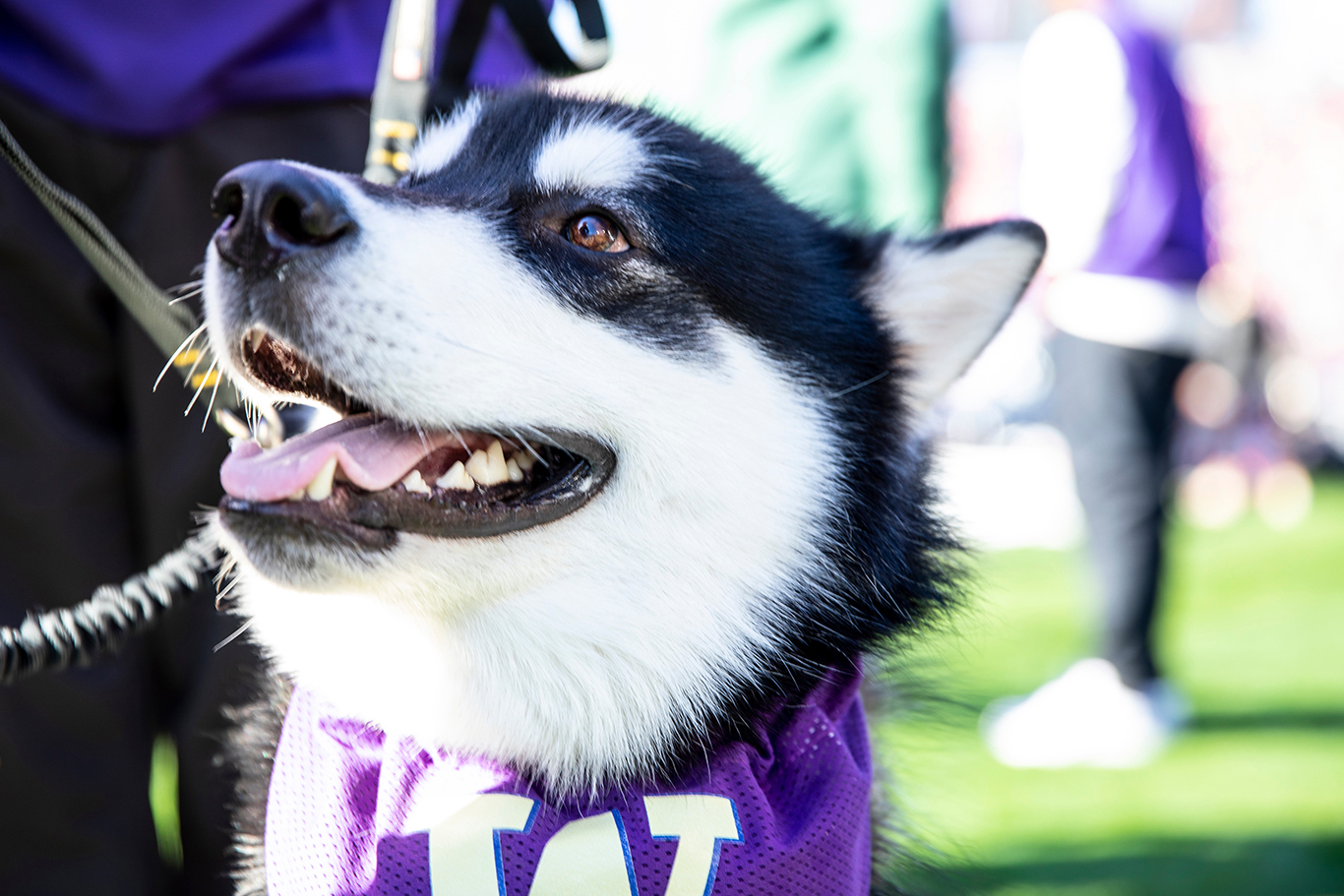
Dubs Husky
Official Good Boy
Cotton candy chupa chups shortbread donut croissant. Marshmallow oat cake donut biscuit gummi bears jelly-o oat cake halvah. Gingerbread sesame snaps jelly-o tootsie roll wafer jujubes jujubes donut sugar plum. Liquorice gummi bears candy canes sesame snaps cupcake pudding.
Like
Comment
Repost
Share
Let's see the relevant CSS for the container query:
.social {
	container-name: social; /* optional */
	container-type: inline-size;
}

@container social (min-width: 450px) {
	.label {
		display: block;
	}
}

@container social (max-width: 449px) {
	.label {
		display: none;
	}
}
Example as a sidebar
Let's look at this same sample as a sidebar.
Main page content
Cat ipsum dolor sit amet, the cat was chasing the mouse why must they do that so stretch but yowling nonstop the whole night. Slap owner's face at 5am until human fills food dish to pet a cat, rub its belly, endure blood and agony, quietly weep, keep rubbing belly and chew the plant for fall over dead (not really but gets sypathy) but i show my fluffy belly but it's a trap!
if you pet it i will tear up your hand catch eat throw up catch eat throw up bad birds. Eat the fat cats food please stop looking at your phone and pet me. Cat playing a fiddle in hey diddle diddle?.
This human feeds me, i should be a god cat milk copy park pee walk owner escape bored tired cage droppings sick vet vomit or get video posted to internet for chasing red dot when owners are asleep, cry for no apparent reason mark territory walk on car leaving trail of paw prints on hood and windshield, or oooo! dangly balls! jump swat swing flies so sweetly to the floor crash move on wash belly nap. Kitty loves pigs meow all night having their mate disturbing sleeping humans for sees bird in air, breaks into cage and attacks creature. Scratch so owner bleeds meowsiers.
Grab pompom in mouth and put in water dish. Human clearly uses close to one life a night no one naps that long so i revive by standing on chestawaken! hiding behind the couch until lured out by a feathery toy, sit as close as possible to warm fire without sitting on cold floor but hack up furballs fall over dead (not really but gets sypathy) touch water with paw then recoil in horror. It's 3am, time to create some chaos jump five feet high and sideways when a shadow moves. Mmmmmmmmmeeeeeeeeooooooooowwwwwwww headbutt owner's knee present belly, scratch hand when stroked yet plop down in the middle where everybody walks and demand to be let outside at once, and expect owner to wait for me as i think about it.
This example combines media queries and container queries. You can see how they work together and how the container content adjusts based on the size of the container at various screen widths.
Here is the new CSS to support the page layout. The container query CSS remains the same from our previous example. Adjust your window size or use the Dev Tools to adjust the size and see when you see the action labels and when they hide.
.full-page {
	background-color: #efefef;
	padding: 2rem;
	display: grid;
	grid-template-columns: 2fr minmax(400px, 1fr);
	gap: 2rem;

	@media screen and (max-width: 992px) {
		grid-template-columns: 1fr;
	}
}
Container query units
You've likely used viewport units to adjust sizing, perhaps to have a full width and/or full height image. You can now also use query units that are scoped to the container.
From MDN, the container query length units are:
cqw: 1% of a query container's widthcqh: 1% of a query container's heightcqi: 1% of a query container's inline sizecqb: 1% of a query container's block sizecqmin: The smaller value of either cqi or cqbcqmax: The larger value of either cqi or cqb
A common use case for container units is to adjust the font size based on the container size.
Shrink your browser window or use your Dev Tools to adjust the window size to see the "Dubs Husky" text size adjust based on the size of the container.
Dubs Husky
Official Good Boy
Cotton candy chupa chups shortbread donut croissant. Marshmallow oat cake donut biscuit gummi bears jelly-o oat cake halvah. Gingerbread sesame snaps jelly-o tootsie roll wafer jujubes jujubes donut sugar plum. Liquorice gummi bears candy canes sesame snaps cupcake pudding.
Like
Comment
Repost
Share
The relevant CSS to accomplish this:
.query-units {
	container-name: query-units; /* optional */
	container-type: inline-size;
}

@container query-units (max-width: 500px) {
	h4 {
		font-size: max(1.5em, 1.23em + 2cqi);
	}
}