Table Design Overview
Using tables to lay out content on a web page requires some forethought. Often you need to make some decisions as to how many rows and how many columns. How wide should the table be? How wide should each column be? Do you want to combine some rows to make a tall cell in the table? Or combine some columns to make a wide cell? Let's look at some table designs and then build them step by step.
Here is an example of a simple table with 3 rows and 3 columns.

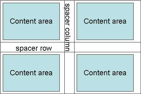
The first thing you might do to use this table for layout is to move the column lines over and the row lines up and down to create a "spacer" row and "spacer" column. This in effect creates a web page divided into four sections with a space between the sections.

Rows can be combined and columns can be combined to create more complicated layouts. Below is an example of a simple table and then one that has been rearranged with spacers and combined rows and columns.
Now, move lines to create "spacers". (Note: the next two pages show you how to do this.)
Now, combine (merge) some cells to create this.
Don't worry about the height of the cells in the table. As you add graphics or text the cells expand in height.
Move on to the next two pages to see how to move cell boundaries and merge cells.