My first attempts at shiny apps
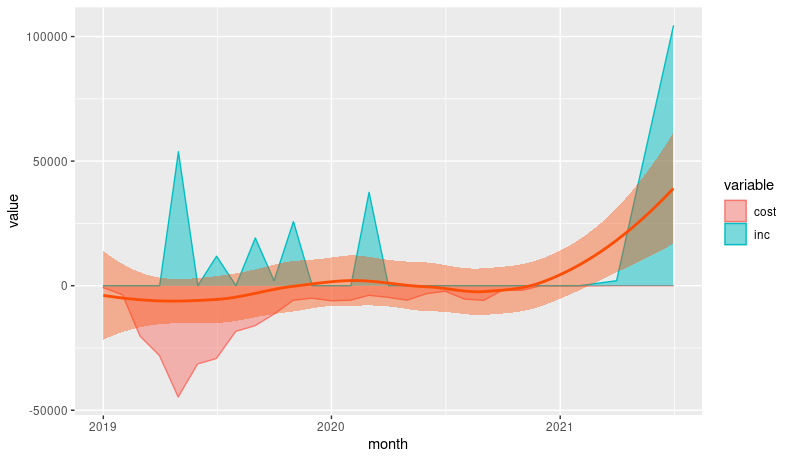
recent trial (notice the final payment date)
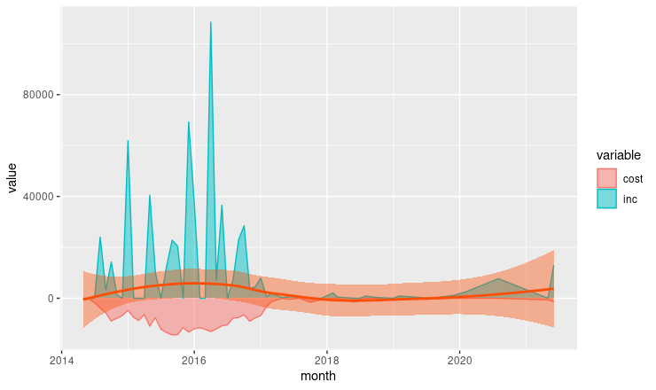
the first trial I successfully illustrated as a time-series
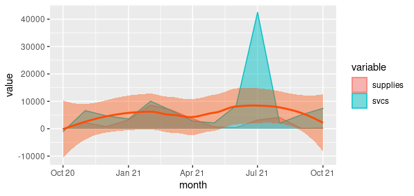
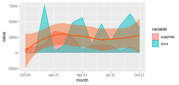
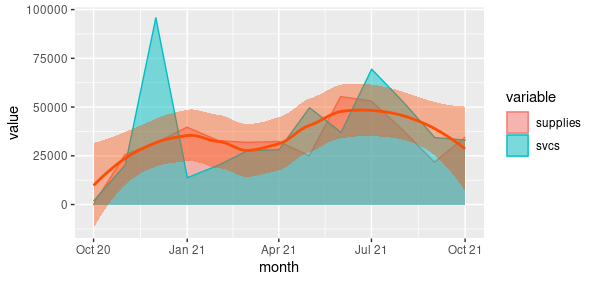
Time series comparing supply and services costs
one particular account with loess line
so, this might be a way to use scatter plots comparing 2022 to 2023
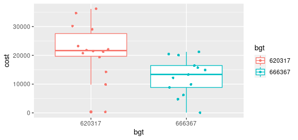
accounts for one investigator
all accounts
This may be a cleaner presentation:
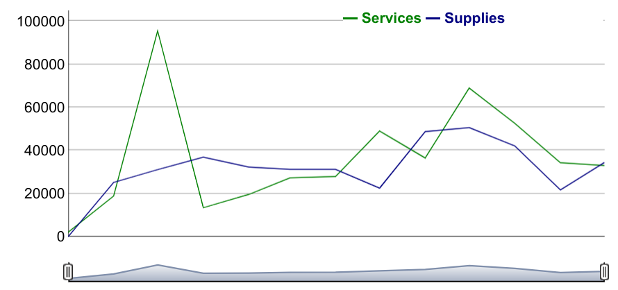
Time series with a stacked graph for supplies and services
Tried to use boxplots with jitter, but bar plots probably are better.
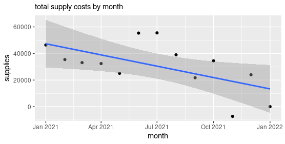
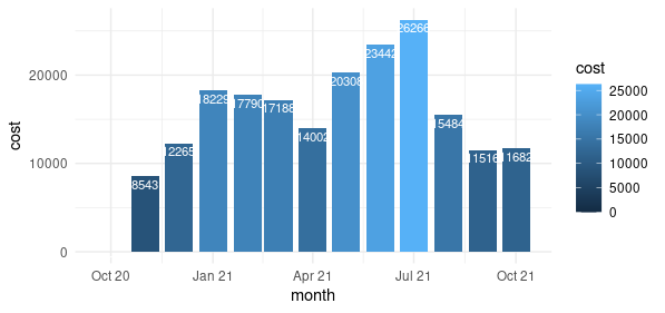
supply costs by month
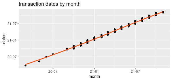
simple scatterplot with number of transactions by month - low activity last summer
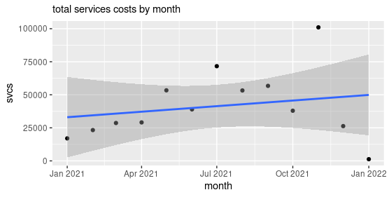
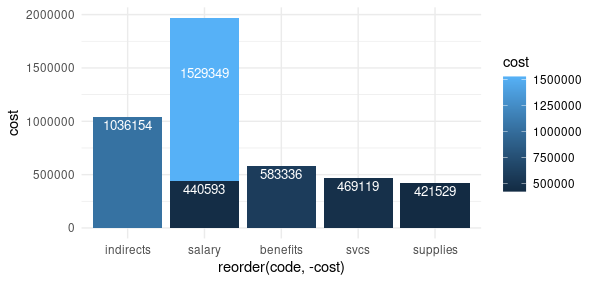
bar plots - now that I understand numcolwise(sum) and labels
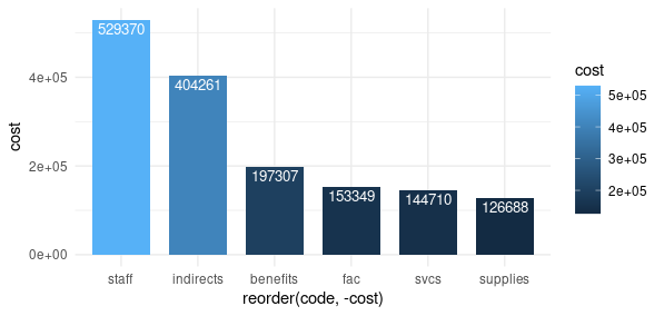
this puts the faculty and staff salaries together in one bar
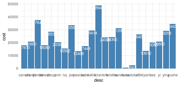
staff salary detail by person
Some interactive graphics using the cost and income values from a prospective clinical trial, with some possibly predictive plans for enrollment and treatment.
One Subject completing all procedures and showing startup funds.
Four Subjects completing all procedures with offset enrollment. This is one example where the roll function for average number of time stamps helps the illustration.
- See the "Clinical Trial" examples below for interactive amounts by month on an actual trial (graphic on Home):
dygraphs for R lets you do fancy highlights:
Clinical Trial highlights
dygraphs also allows a roll average display - change the number in the bottom
left to show a different average
Roll Average
This project shows effort data I recorded as a grants manager from 16 Sep 2017 to 15 Sep 2018. Interpretation and conclusions are pending review at the Journal of Research Administration, Society of Research Administrators International (SRAI)
Effort for the three largest categories of business interest
Effort1 for the three smallest categories