
It should be, "as complicated as necessary, but not more so", -Robert A. Wilson
getting back to doing plots:
a little practice using scp
publishing on Rpubs:
This give you all the published graphs
bar plot costs by category for all grants:

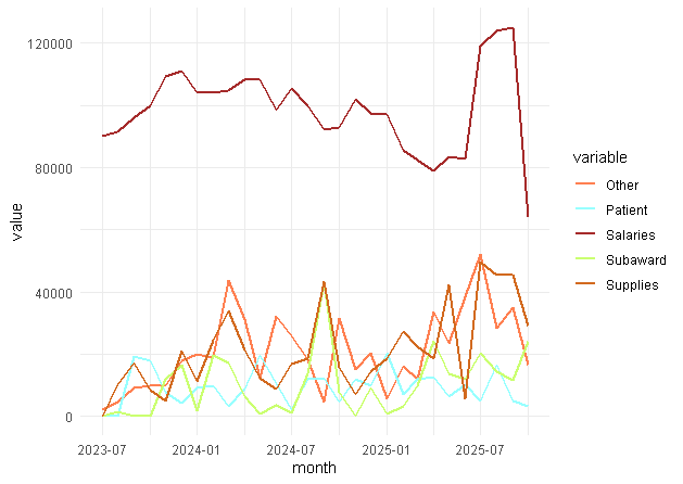
time series 2023 to present of salary, supplies, other, and patient costs for the bar graph above:
stacked bar graph for by code for all accounts

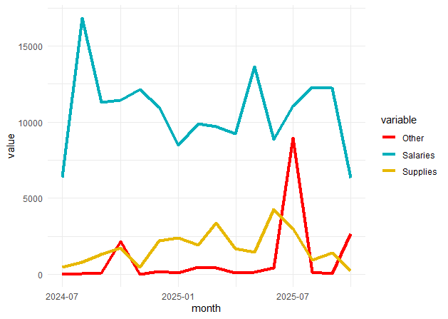
one particular project for a trial that recently started:
one particular project for a trial that's been open since 2023:
I'm so happy when R works!
This is a cool shiny interactive example that I've forgotten how to create:

Contact: mounce@uw.edu
so, I tried having ChatGPT create an interactive web graphic. I know a little about MRFM, and after a few prompts managed to get a decent ``spinometer'' - amazed me!
01100100 01101111 01110101 01100111 00100000 01101101 01101111 01110101 01101110 01100011 01100101