05 September, 2019

Mapping with R

Today’s example demonstrates these objectives:

  • Use various packages in R to create static and interactive maps.
  • Use an API key to use Google’s geocoding API.
  • Use shapefiles to add features to maps.
  • Use web and PDF “scraping” techniques to extract data.
  • Use public datasets freely available on the web.
  • Use “literate programming” to provide a reproducable report.
  • Use a consistent coding style.
  • Share code through a public repository to facilitate collaboration.

The code and this presentation are free to share and modify according to the MIT License.

Washington Measles Outbreak of 2019

In early 2019 there were two outbreaks of measles in Washington State:

  • Outbreak #1: January through May with 72 confirmed cases.
  • Outbreak #2: May 9th through August 28th with 14 confirmed cases.

There were also some notable responses by state and local governments:

  • Clark County declared a local public health emergency on Jan. 18.
  • The Washington governor declared a state of emergency on Jan. 25.
  • In May, Washington passed a bill to limit measles vaccination exemptions.
    • Took effect on July 28th for public and private schools and daycare centers.
    • Removed the personal and philosophical exemptions for the MMR vaccine.

Washington Measles Outbreak of 2019

Here are some details about the 86 confirmed cases in the outbreaks:

  • Most were in Clark County (71 cases) and King County (12 cases).
  • Most were in children ages 1 to 10 (52 cases) and 11 to 18 (17 cases).
  • Most had a vaccination status of “0 doses” (66) and “unknown” (11).

Here are some questions we may have about these findings:

  • Were Clark County and King County especially susceptible?
  • Why were children aged 1 to 10 years infected the most?

Can you think of other interesting questions?

How can data visualization, particularly mapping, help answer these?

Washington Measles Outbreak of 2019

Using public data, we will use mapping techniques to visualize the status of immunization in schools throughout the state and the outbreak exposure locations associated with these events.

  • A choropleth map showing school (K-12) immunization rates in WA counties.
  • A map showing exposure sites involved in the measles outbreak.
  • An interactive map showing immunization rates for all WA schools (K-12).
  • An interactive map showing school districts, schools, and exposure sites.

Mapping with ggplot2

We will use ggplot2 to plot a choropleth map of K-12 immunization coverage in Washington counties.

choropleth

Setup

Load packages with pacman to auto-install any missing packages.

# Load packages.
if (!suppressPackageStartupMessages(require(pacman))) {
  install.packages("pacman", repos = "http://cran.us.r-project.org")
}
pacman::p_load(dplyr, tidyr, maps, ggplot2, knitr, kableExtra)

We are loading:

  • dplyr and tidyr for data management
  • maps for getting county polygons
  • ggplot2 for plotting the map
  • knitr and kableExtra for making tables with kable()

Get and clean data

Get the K-12 immunization coverage by county for Washington State. Since this data cannot be downloaded directly from our R script, we had to get this data using the School Immunization Dashboards tool hosted by the Washington State Department of Health and save it as a CSV file.

data_fn <- paste0('wa_state_counties_k-12_immunization_status', 
                  '_data_2018-2019.csv')
data_path <- file.path('..', 'mapping_with_ggplot2', data_fn)
wa_coverage <- read.csv(data_path, stringsAsFactors = FALSE) %>% 
  filter(State == "Washington") %>% 
  select(county = Name, Measure, Percent) %>% 
  spread(key = Measure, value = Percent) %>% 
  mutate_at(.vars = c('Complete', 'Exempt'), 
            .funs = ~as.numeric(sub('%', '', .)))

Lowest-10 County Immunization Rates

kable(wa_coverage %>% arrange(Complete) %>% head(10)) %>% 
  kable_styling(full_width = F) %>% row_spec(6, bold = T, color = "black")
county Complete Exempt
San Juan 64.9 9.3
Ferry 74.9 15.0
Pend Oreille 76.1 8.1
Jefferson 76.7 12.9
Stevens 76.7 9.0
Clark 80.3 7.5
Klickitat 82.4 10.2
Thurston 82.6 6.1
Wahkiakum 83.8 10.2
Lincoln 84.0 7.6


Of the four counties (Clark, King, Pierce, Snohomish) which had confirmed measles cases in 2019, only Clark County (80.3%) makes this “Lowest-10” list. This county is also the one with the highest number of cases (71 of 86, or 83%)

Prepare variables for plotting

Convert immunization percent complete variable to a factor with 5 bins. This will allow us to limit the number of colors showing on the map and control the values they represent. Since most of the counties have immunization rates over 75%, we will will use more bins in the high end of the range for better differentiation.

wa_coverage$Complete_fct <- factor(
  cut(x = wa_coverage$Complete, 
      breaks = c(0, 75, 85, 90, 95, 100), include.lowest = TRUE, 
      labels = c("<75%", "75-84%", "85-89%", "90-94%", "95-100%"),
      ordered_result = TRUE))

Get county polygons and labels

To plot the counties, we need the polygons that define their borders. We can get them using the maps package.

# Get Washington counties.
counties <- map_data("county")
wa_county <- subset(counties, region == 'washington') %>%
  mutate(county = tools::toTitleCase(subregion)) %>% 
  select(long, lat, county, group) %>% 
  left_join(wa_coverage, by = 'county')

We also need to create a dataframe of labels with county names and their locations so we can label the counties on the map. The location for each label will be the center of the county’s polygon.

# Create a dataframe for county labels.
county_names <- wa_county %>% 
  mutate(county = paste0(county, '\n', Complete, '%')) %>% group_by(county) %>% 
  summarise_at(.vars = c('long', 'lat'), .funs = ~ mean(range(.)))

Create the choropleth map

Use ggplot() to combine the polygons, color them, and add labels.

# Plot map.
g <- ggplot() +
  geom_polygon(data = wa_county, 
               aes(x = long, y = lat, group = group, fill = Complete_fct),
               color = "gray50", alpha = 0.4) + 
  scale_fill_brewer(palette = "YlOrRd", direction = -1) + 
  geom_text(data = county_names, aes(long, lat, label = county),
            size = 2.5, color = "gray10") +
  coord_quickmap() + theme_void() +
  labs(x = NULL, y = NULL, fill = NULL,
       title = "School Immunization Coverage in Washington Counties",
       subtitle = "Percent complete for all students, K-12, 2018-2019",
       caption = paste("Source: School Immunization Dashboards,", 
                       "Washington State Department of Health")
  ) + theme(plot.caption = element_text(face = "italic"))

Immunization Coverage in Washington

Mapping with ggmap

Clark County

We will use the ggmap package to create maps with detailed basemaps.

ggmap offers a selection of sources and styles of basemap tiles.

Our first map will use the “toner-lite” tiles from the “stamen” source.

The 2019 measles outbreak in Washington affected Clark County the most, with 71 cases as of August 2019. The state total was 86.

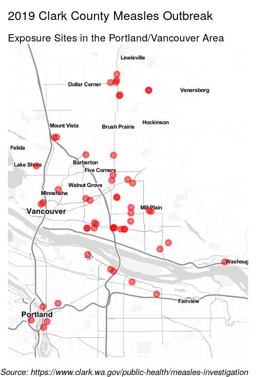
We will plot a map of exposure sites from the Clark County Public Health measles investigation of 2019. We will restrict the map to the Portand/Vancouver area.

Setup

Load packages with pacman to auto-install any missing packages.

# Load packages.
if (!suppressPackageStartupMessages(require(pacman))) {
  install.packages("pacman", repos = "http://cran.us.r-project.org")
}
pacman::p_load(rvest, dplyr, tidyr, ggmap)

We are loading:

  • rvest for web scraping
  • dplyr and tidyr for data management
  • ggmap for geocoding and creating the map

Using the Google Geocoding API

We are using the Google Geocoding API to find geolocations for measles exposure sites and schools. A geolocation is the pair of geographic coordinates (latitude and longitude) for a particular location.

If you would like to use the Geocoding API, you will need an API key from Google.

Google’s Geocoding API key page says, “The API key is a unique identifier that is used to authenticate requests associated with your project for usage and billing purposes.” You are given a monthly credit worth several thousand lookups per month, so the geocoding we do for this presentation should not incur charges.

Your API key is a text string that you can store in a file. But you don’t want to put it in a script, as you might share the script and you don’t want others to see this key. It is better to store it in a more secure location.

The code in this presentation will look for the API key in the file ~/google_api.key. So, you would need to create this as a “plain text” file and paste the contents of your API key in it using a text editor.

Get data

We will get exposure sites from Clark County Public Health using “web scraping”, then get the geolocations for these sites with geocoding using the Google API.

If you have the data file which we have provided for you in the Github repository, then the geocoding step will be skipped.

data_fn <- file.path("..", "mapping_with_ggmap", "clark_co_measles_locations.csv")
if (!file.exists(data_fn)) {
  url <- 'https://www.clark.wa.gov/public-health/measles-investigation'
  exposure_site <- read_html(url) %>% html_nodes(".field-content") %>% 
    html_nodes("li") %>% html_text() %>% gsub('^\n', '', .) %>% 
    gsub('(?: from |\n| on | Tuesday|,? ?[0-9]+:).*', '', .) %>% 
    grep('^[0-9]|^They|^Noon|^$', ., value = TRUE, invert = TRUE)
  key_fn <- '~/google_api.key'
  if (file.exists(key_fn)) {
    register_google(key = readLines(key_fn))
    if (has_google_key()) {
      locations <- geocode(location = exposure_site)
      locations$site <- exposure_site
      write.csv(locations, data_fn, row.names = FALSE)
    }
  }
} else { locations <- read.csv(data_fn, stringsAsFactors = FALSE) }

Create the map

# Restrict map to the Portand/Vancouver area by removing those in Bend.
locations <- locations %>% filter(!grepl('Bend', site))

# Prepare the basemap from the stamen source and toner-lite tiles.
stamen_basemap <- suppressMessages(get_stamenmap(
  make_bbox(lon, lat, locations, f = .15), zoom = 10, maptype = "toner-lite"))

# Add points and labels to the basemap, using a theme that hides axis labels.
g <- ggmap(stamen_basemap) + 
  geom_point(mapping = aes(x = lon, y = lat), data = locations, 
             color = 'red', size = 2, alpha = 0.5) + 
  theme_void() +
  labs(x = NULL, y = NULL, fill = NULL,
       title = "2019 Clark County Measles Outbreak", 
       subtitle = "Exposure Sites in the Portland/Vancouver Area",
       caption = paste(
         "Source: https://www.clark.wa.gov/public-health/measles-investigation"
       )
  ) + theme(plot.caption = element_text(face = "italic", size = 7))

Clark County Measles Outbreak

Clark County Exposed Schools

locations$site[1] <- paste0(locations$site[1], ', Vancouver')
sites <- gsub('^([^,]+).*,([A-Za-z .]+)$', '\\1,\\2', unique(locations$site))
sites[grepl('School|Academy|Daycare|HomeLink|Home Connection', 
                   sites, ignore.case = TRUE)]
##  [1] "Cornerstone Christian Academy, Vancouver"  
##  [2] "Vancouver Home Connection, Vancouver"      
##  [3] "Hearthwood Elementary School, Vancouver"   
##  [4] "Slavic Christian Academy, Vancouver"       
##  [5] "Image Elementary School, Vancouver"        
##  [6] "Eisenhower Elementary School, Vancouver"   
##  [7] "Tukes Valley Primary School, Battle Ground"
##  [8] "Tukes Valley Middle School, Battle Ground" 
##  [9] "Maple Grove School, Battle Ground"         
## [10] "River HomeLink, Battle Ground"             
## [11] "Evergreen High School, Vancouver"          
## [12] "Orchards Elementary School, Vancouver"     
## [13] "Minnehaha Elementary School, Vancouver"    
## [14] "Yelena’s Daycare, Vancouver"               
## [15] "Pacific Middle School, Vancouver"          
## [16] "Burton Elementary School, Vancouver"

Clark County Measles Outbreak

So, what can we conclude so far about this outbreak?

From tallying the exposure site locations, we find that:

  • There were 52 sites, 42 of them in Clark County (81%).
  • There were 16 school sites (31%), including 7 elementary school sites.

We also know from county reports that:

  • 66 of 71 cases were children age 1-18. 52 of these cases were age 1-10.
  • 68 cases were unimmunized or unverified.

Since most of the cases (81%) were in Clark County, Clark County is only 80.3% complete for immunization, most of the cases (96%) were children, and many of the exposure sites (31%) were schools, measles is likely to have spread at schools during this outbreak.

Therefore, it may be worthwhile to take a closer look at the individual schools.

How about King County?

King County

King County published the exposure sites in batches:

From the sources linked above, it appears these cases were mostly adults. Infection of the few children was due to household contact with previously diagnosed adults. In this region, measles did not appear to be spreading at schools or daycare centers.

This map and the ones on the next slide were made with this script: King County Measles Exposure Sites

Alternate basemaps for ggmap

For comparison, here are the King County measles exposure sites shown with Stamen Toner-Lite tiles, Stamen Terrain tiles, Google Terrain tiles.

Mapping with leaflet

leaflet is a Javascript library for making interactive maps. It can be used from various programming languages, including R.

Clark County

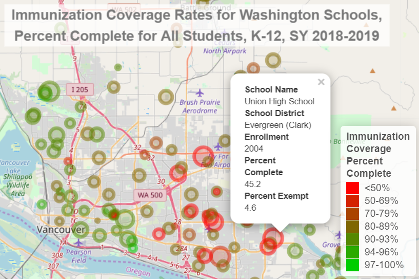
We will make a leaflet map showing the location of all of the K-12 schools in the state.

We will plot these as circles where the size indicates the student enrollment and the color indicates the immunization coverage rate.

This will allow us to see if there are “pockets” of low immunization rates.

Setup

Load packages with pacman to auto-install any missing packages.

# Load packages.
if (!suppressPackageStartupMessages(require(pacman))) {
  install.packages("pacman", repos = "http://cran.us.r-project.org")
}
pacman::p_load(dplyr, tidyr, leaflet, htmlwidgets, htmltools, rgdal, rgeos, 
               knitr, kableExtra, ggmap)

We are loading:

  • dplyr and tidyr for data management
  • leaflet to create the map visualization
  • htmlwidgets and htmltools to add HTML titles and to sanitize data
  • rgdal for reading and manipulating shapefiles
  • rgeos for finding the center of a polygon (centroid)
  • knitr and kableExtra for making tables with kable()
  • ggmap for geocoding with geocode()

Get data

We have to download the data files manually from the WA DoH website since their site does not support automated downloads from R.

# Read immunization status data file.
data_fn <- file.path('..', 'mapping_with_leaflet',
      'wa_state_schools_k-12_immunization_status_data_2018-2019.csv')
wa_coverage <- read.csv(data_fn, stringsAsFactors = FALSE, check.names = FALSE)

# Read immunization exemption data file and clean-up.
ex_data_fn <- file.path('..', 'mapping_with_leaflet',
      'wa_state_schools_k-12_immunization_exemption_data_2018-2019.csv')
wa_ex <- read.csv(ex_data_fn, stringsAsFactors = FALSE, check.names = FALSE)
wa_ex <- wa_ex %>% mutate(Exempt = as.numeric(gsub('%', '', Percent))) %>% 
  filter(Enrollment > 0) %>% select(`School Name`, `Bldg No`, Exempt)

# Merge data sets and clean-up.
wa_coverage <- wa_coverage %>% 
  left_join(wa_ex, by = c('School Name', 'Bldg No')) %>%
  rename('lat' = 'Latitude', 'lon' = 'Longitude') %>% 
  select(`School Name`, `School District`, County, 
         Enrollment, Percent, Exempt, lat, lon) %>%
  mutate(Percent = as.numeric(gsub('%', '', Percent))) %>% 
  filter(Enrollment > 0) %>% drop_na(lat, lon)

Fix school locations

Some school locations provided by WA DoH do not have the correct coordinates.

We can fix them by geocoding with the geocode() function. If you don’t have your key stored in the file ~/google_api.key, then the geocoding step will be skipped.

schools_regex <- 'La Center|Tukes Valley Middle School'
key_fn <- '~/google_api.key'
if (file.exists(key_fn)) {
  register_google(key = readLines(key_fn))
  if (has_google_key()) {
    new_locations <- wa_coverage %>% filter(grepl(schools_regex, `School Name`)) %>%
      pull(`School Name`) %>% geocode()
    wa_coverage[grepl(schools_regex, wa_coverage$`School Name`), 
                c('lon', 'lat')] <- new_locations
  }
}

Some schools have the same coordinates as others, so we will separate them with jitter().

wa_coverage <- wa_coverage %>% mutate_at(vars(lat, lon), ~jitter(.))

Prepare “Popups” and “Tooltips”

When you click on a point (circle) in our leaflet map, we want a popup to show some details about the school.

wa_coverage <- wa_coverage %>% mutate(Popup = paste0('<dl>', 
    '<dt>', 'School Name', '</dt><dd>', htmlEscape(`School Name`), '</dd>',
    '<dt>', 'School District', '</dt><dd>', htmlEscape(`School District`), '</dd>',
    '<dt>', 'Enrollment', '</dt><dd>', htmlEscape(`Enrollment`), '</dd>',
    '<dt>', 'Percent Complete', '</dt><dd>', htmlEscape(`Percent`), '</dd>',
    '<dt>', 'Percent Exempt', '</dt><dd>', htmlEscape(`Exempt`), '</dd>', '</dl>'))

When you “hover” over a school circle, show a small popup “tooltip” with the school name and immunization rate.

wa_coverage <- wa_coverage %>% 
  mutate(label = paste0(`School Name`, ': ', Percent, '%'))

Make the map

# Cut the continuous variable "Percent complete" into bins making factor levels.
wa_coverage$Pct <- 
  cut(wa_coverage$Percent, c(0, 50, 70, 80, 90, 94, 97, 100), include.lowest = TRUE, 
      labels = c('<50%', '50-69%', '70-79%', '80-89%', '90-93%', '94-96%', 
                 '97-100%'), ordered_result = TRUE)

# Assign a palette to this factor variable using colorFactor.
pal <-
  colorFactor(palette = colorRamp(c("red", "green3"), interpolate = "spline"),
  wa_coverage$Pct)

# Create the leaflet map, using the color palette for the circles and legend.
g <- leaflet(data = wa_coverage) %>% addTiles() %>% 
  addCircleMarkers(lng = ~lon, lat = ~lat, radius = ~sqrt(Enrollment) * .3, 
                   color = ~pal(Pct), label = ~htmlEscape(label),
                   popup = ~Popup) %>% 
  addLegend("bottomright", pal = pal, values = ~Pct, opacity = 1, 
            title = "Immunization<br>Coverage<br>Percent<br>Complete")

Add a title

Leaflet makes a web visualization so we need to use some CSS and HTML to make the title.

tag.map.title <- tags$style(HTML("
  .leaflet-control.map-title { 
                                 transform: translate(-50%,20%);
                                 position: fixed !important;
                                 left: 50%;
                                 text-align: center;
                                 padding-left: 10px; 
                                 padding-right: 10px; 
                                 background: rgba(255,255,255,0.75);
                                 font-weight: bold;
                                 font-size: 20px;
                             }
  "))

title <- tags$div(tag.map.title, 
  HTML(paste("Immunization Coverage Rates for Washington Schools,<br>", 
             "Percent Complete for All Students, K-12, SY 2018-2019"))
) 

g1 <- g %>% addControl(title, position = "topleft", className="map-title")

Immunization Coverage in Washington

Add exposure sites

Do the exposure sites cluster in areas of low immunization coverage? Let’s add markers for the Clark County measles outbreak exposure sites.

# Update the title.
title <- tags$div(tag.map.title, 
  HTML(paste("Clark County 2019 Measles Outbreak Exposure Sites<br>",
             "and K-12 Immunization Coverage, SY 2018-2019"))
)

# Add a label variable to the locations data frame.
locations <- unique(locations) %>% mutate(site = htmlEscape(site)) %>% 
  mutate(label = gsub('^([^,]*),.*$', '<b>Exposure Site:</b> \\1', site))

# Add markers for the exposure sites and hover-over ("tooltip") label.
g2 <- g %>% addMarkers(~lon, ~lat, data = locations, group = "exposure", 
                       icon = list(iconUrl = 'biohazard.svg', 
                                   iconSize = c(20, 20)), 
                       label = ~lapply(label, HTML), 
                       labelOptions = labelOptions(
                         style = list('background-color' = 'yellow'))) %>% 
  setView(-122.5487, 45.65366, zoom = 11) %>% 
  addControl(title, position = "topleft", className="map-title")

Clark County Measles Outbreak

Coverage by school district

It looks like many of the large, red circles are clustered together. This same region is where many of the exposure locations are. Let’s look at immunization coverage by school district to see if there are any districts which stand out.

# Create a dataframe for districts.
wa_coverage_by_dist <- wa_coverage %>% 
  mutate(`School District` = gsub('\\s+', ' ', `School District`)) %>% 
  group_by(County, `School District`) %>% 
  summarise(
    Percent = round(100 * (sum(0.01 * Percent * Enrollment)/sum(Enrollment)), 1),
    Exempt = round(100 * (sum(0.01 * Exempt * Enrollment)/sum(Enrollment)), 1))
kable(wa_coverage_by_dist %>% filter(County == 'Clark') %>% arrange(Percent)) %>% 
  kable_styling(full_width = F) %>% row_spec(1, bold = T, color = "red")
County School District Percent Exempt
Clark Evergreen (Clark) 62.0 4.7
Clark La Center 82.0 5.8
Clark Hockinson 82.4 7.9
Clark Green Mountain 84.7 4.9
Clark Battle Ground 85.5 10.0
Clark Washougal 89.3 4.0
Clark Camas 90.7 6.4
Clark Vancouver 91.0 5.2
Clark Ridgefield 92.9 4.6

Get school district polygons

We can import a shapefile from census.gov to see which schools are in each district. We must transform the map projection from NAD83 to WGS84 to match leaflet.

# Get compressed shapefile archive and etract to the "gis" folder.
shp_fn <- 'tl_2019_53_unsd.zip'
if (!file.exists(shp_fn)) {
  url <- paste0('https://www2.census.gov/geo/tiger/TIGER2019/UNSD/', shp_fn)
  download.file(url, destfile = shp_fn)
  unzip(zipfile = shp_fn, exdir = "gis")
}

# Import shapefile from the "gis" folder and view the projection string.
shapeData <- readOGR("gis", verbose = FALSE)
CRSargs(shapeData@proj4string)
## [1] "+proj=longlat +datum=NAD83 +no_defs +ellps=GRS80 +towgs84=0,0,0"
# Transform shape data to the projection of the map (from NAD83 to WGS84).
# See: https://rstudio.github.io/leaflet/projections.html
shapeData <- spTransform(shapeData, CRS("+proj=longlat +datum=WGS84 +no_defs"))

Prepare variables for plotting

# Make a factor to use for fill color of polygons.
wa_coverage_by_dist$Pct <- 
  cut(wa_coverage_by_dist$Percent, 
      c(0, 50, 70, 80, 90, 94, 97, 100), include.lowest = TRUE, 
      labels = c('<50%', '50-69%', '70-79%', '80-89%', '90-93%', '94-96%', 
                 '97-100%'), ordered_result = TRUE)

# Filter to include only Clark County school districts.
wa_coverage_by_dist_clark <- wa_coverage_by_dist %>% filter(County == 'Clark')
shapeData$NAME <- gsub(' School District| Public Schools| Community Schools', 
                       '', shapeData$NAME)
shapeData_clark <- shapeData[
  shapeData$NAME %in% wa_coverage_by_dist_clark$`School District`, 'NAME']
shapeData_clark <- shapeData_clark[order(shapeData_clark$NAME), ]

# Add coverage percent and factor for color bins.
shapeData_clark$Percent <- wa_coverage_by_dist_clark$Percent 
shapeData_clark$Pct <- wa_coverage_by_dist_clark$Pct

# Create labels and popups for school districts.
centers <- data.frame(gCentroid(shapeData_clark, byid = TRUE))
centers$NAME <- paste0(shapeData_clark$NAME, ': ', shapeData_clark$Percent, '%')

Add school district polygons to map

# Create map as before, but add polygons and labels before other elements.
g3 <- leaflet(data = wa_coverage) %>% 
  setView(-122.5487, 45.65366, zoom = 11) %>% 
  addControl(title, position = "topleft", className ="map-title") %>% 
  addTiles(group = "map-detail") %>% 
  addLegend("bottomright", pal = pal, values = ~Pct,
    title = "Immunization<br>Coverage<br>Percent<br>Complete",
    opacity = 1, group = "legend") %>% 
  addPolygons(group = "districts", data = shapeData_clark, weight = 4, 
    color = 'gray', opacity = 0.4,stroke = TRUE, smoothFactor = 0.2, 
    fillOpacity = 0.3, fillColor = pal(shapeData_clark$Pct)) %>% 
  addLabelOnlyMarkers(group = "dist-labels", data = centers, lng = ~x, lat = ~y,
    labelOptions = labelOptions(textsize='12px', opacity = 0.8, noHide = TRUE, 
      direction = 'top', textOnly = FALSE), label = htmlEscape(~NAME)) %>% 
  addCircleMarkers(group = "schools", lng = ~lon, lat = ~lat, color = ~pal(Pct), 
    radius = ~sqrt(Enrollment) * .3, popup = ~Popup, label = ~htmlEscape(label)) %>% 
  addMarkers(lng = ~lon, lat = ~lat, data = locations, group = "exposure", 
    icon = list(iconUrl = 'biohazard.svg', iconSize = c(20, 20)), 
    label = ~lapply(label, HTML), labelOptions = labelOptions(
                         style = list('background-color' = 'yellow'))) %>% 
  addLayersControl(baseGroups = c("map-detail", "no-map-detail"), 
    overlayGroups = c("legend", "districts", "dist-labels", "schools", "exposure"),
    options = layersControlOptions(collapsed = TRUE))
Clark County Measles Outbreak

Exposure locations per school district

Count the number of exposure locations in Clark County per school district using the over() function from the sp package.

coordinates(locations) <- ~ lon + lat
proj4string(locations) <- proj4string(shapeData_clark)
over(locations, shapeData_clark) %>% drop_na() %>% group_by(NAME) %>% 
  summarise(Count = n()) %>% arrange(desc(Count)) %>% 
  kable() %>% kable_styling(full_width = F) %>% row_spec(1, bold = T, color = "red")
NAME Count
Evergreen (Clark) 19
Vancouver 11
Battle Ground 10
Camas 1
Washougal 1

Publishing leaflet maps on the web

Since leaflet maps are made for the web, they can be published as web pages.

saveWidget(g1, file = "wa_immunization_coverage_leaflet_map.html")
saveWidget(g3, file = "clark_co_measles_outbreak_leaflet_map.html")

To publish, you simply need to copy the HTML output file to a web server and configure the file to be accessible, as you would for any static HTML web page.

The following interactive maps from the presentation have been published on the web:

Exercise 1: Choropleth with ggplot2

Create a choropleth map of K-12 Immunization Rates for Oregon Counties for the 2018-2019 school year. You can download a PDF containing the necessary data. This PDF is linked from the Oregon School Immunization Data page. Use the “Complete for All Required Immunizations (%)” values for the county “fill” colors. To extract the data from the tables in the PDF, you may wish to use the tabulizer package:

library(dplyr)
library(tabulizer)
url <- paste0('https://www.oregon.gov/oha/PH/PREVENTIONWELLNESS/', 
              'VACCINESIMMUNIZATION/Documents/RatesK12ImmandExmptbyCounty.pdf')
mat <- do.call('cbind', extract_tables(file = url))
mat <- mat[, -c(2, 3, 21, 22)]
mat[1, 1] <- 'County'
tmat <- t(mat)
col_names <- tmat[1, ]
df <- as_tibble(tmat[2:nrow(tmat),], .name_repair = 'unique')
names(df) <- col_names
char_percent_to_numeric <- function(x) as.numeric(gsub('%', '', x))
df <- df %>% mutate_at(.vars = col_names[3:length(col_names)], 
                       .funs = char_percent_to_numeric)
data_fn <- file.path('..', 'mapping_with_ggplot2', 
                     'or_counties_k-12_immunization_status_2018-2019.csv')
write.csv(df, data_fn, row.names = FALSE)

Exercise 2: ggmap

The Multnomah Health Officer published a list of exposure locations for the Winter 2019 measles outbreak. Create a map with ggmap which plots the points of these locations.

Here is code you can use to extract the locations from that page:

library(dplyr)
library(rvest)

url <- paste0('https://multco.us/health-officer/', 
              'measles-outbreak-winter-2019-oregon-exposures')
pg <- read_html(url)
site <- pg %>% html_nodes(xpath = '//p/strong') %>% 
  html_text() %>% grep('UPDATED', .,value = TRUE, invert = TRUE)
address <- pg %>% html_nodes('p[style="margin-left:40px"]') %>% 
  html_text() %>% grep('^Date: |Update: |^$', ., value = TRUE, invert = TRUE)
address <- append(address, '7000 NE Airport Way, Portland', 9)
address <- append(address, '2207 NE Broadway Ste 200, Portland', 17)
locations <- tibble(site = site, address = paste(address, 'OR', sep = ', '))
data_fn <- file.path('..', 'mapping_with_ggmap', 'oregon_measles_locations.csv')
write.csv(locations, data_fn, row.names = FALSE)

Exercise 2: ggmap, cont.

Notes:

You can either use the geocode() function in ggmap to get the coordinate points for those locations or you can use whichever web sites, etc., you need to (such as https://www.latlong.net/). Since there are only a few locations, this can be done manually without too much effort, but automating with an R function is preferred.

You can use any basemap you like, but try to choose one which will not obscure the points marking the exposure locations.

Exercise 3: leaflet - King County

The King County Measles Exposure Sites R script was used to download and map exposure locations for the Seattle/Tacoma area.

Create a leaflet map plotting these locations using the same method as was used for the Clark County example shown earlier in this presentation. Include the school district polygons and color them as we did earlier.

Exercise 4: leaflet - Oregon

The state of Oregon has published an Excel data file with the immunization rates for all K-12 schools in the state.

This XLS file is linked from the Oregon School Immunization Coverage page.

Create a leaflet map plotting these locations using the same method as was used for the Washington example earlier in this presentation. That is, make the size of the points indicate school enrollment and make the color indicate the percent immunization coverage.

A modified data file with geolocations for (most of) these schools has been provided for you: or_k12_immunization_coverage.csv.

The code which generated this file is in the next section of this document.

Bonus points if you add markers for the exposure sites from Exercise 2 and add polygons for the Oregon school districts.

Exercise 4: leaflet, cont.

# Geocode the Oregon K-12 school locations
library(readxl)
library(ggmap)

data_dir <- file.path('..', 'mapping_with_leaflet')
data_fn <- file.path(data_dir, "or_k12_immunization_coverage.csv")
if (!file.exists(data_fn)) {
  xls_fn <- file.path(data_dir, 'or_coverage.xls')
  if (!file.exists(xls_fn)) {
    download.file(paste0('https://www.oregon.gov/oha/PH/PREVENTIONWELLNESS/',
                         'VACCINESIMMUNIZATION/GETTINGIMMUNIZED/Documents/',
                         'SchK-12.xls'), xls_fn)}
  or_coverage <- read_xls(xls_fn) %>% 
    mutate(site = paste(SiteName, paste(County, 'County'), 'OR', sep = ', '))
  or_k12_site <- unique(or_coverage$site)
  register_google(key = readLines('~/google_api.key'))
  locations <- geocode(location = or_k12_site)
  locations$site <- or_k12_site
  locations <- locations %>% drop_na() %>% 
    filter(lat < 47, lat > 41, lon < -116, lon > -125)
  or_coverage <- or_coverage %>% left_join(locations, by = 'site')
  names(or_coverage) <- gsub('[:\n]+', ' ', names(or_coverage))
  write.csv(or_coverage, data_fn, row.names = FALSE)
} else { or_coverage <- read_csv(data_fn) }

Want more?