Gentle Reader,
I decided, once, to usher a dear friend into the mysteries of web design. A short note, I thought, composed in an afternoon should do the trick.
I was younger then.
But the goals of this note, grown freakishly long, remain modest.
While much about writing for the web is simple, the legion options rising hydra-like from its frenetic history can be daunting — some heads more toothy, though smiling.
What follows are a few notes to help orient you, if you determine to maintain or create your own material.
This document illustrates basic web tags, common style rules, and server-side includes. It's lean, despite its length, but provides enough terms and examples to give you the skeleton of a working web site, and the ability to make sense of HTML tags it does not discuss, such as tables or forms.
You'll find scores of notes hidden behind the main text — many holding crunchy details you'll need to consult. This is my attempt to set aside the usual quotidial mallet and maintain focus on a practical, three-part structure, suggested by this document's menu.
The argument is common as dirt, and as fundamental. Authors, such as Jeffrey Zeldman, Eric Meyer, Owen Briggs, Eric Costello, and Molly Holzschlag, and organizations, including WASP, Position Is Everything, A List Apart, and the mighty W3.org have championed it for years. Read their sites. They have thought carefully about the topics I breeze past, and sometimes mangle, here. In fact, except for my more inventive confusions, nothing here is original—even, I hope, my outright factual errors.
NOTE: I employ scripts to display additional information and illustrate concepts. If you've installed XP Service Pak II and are reading this page with Internet Explorer, this document won't work correctly until you unblock its scripts.
HTML — hypertext markup language
This section covers HTML in 7 minutes 30 seconds, provided you glance at the pop-up windows and read the embedded glossary text. If you already understand the difference between a tag and text, an in-line and a block-level element, skip down a few paragraphs to "The Box Model." Otherwise. . .
Here's a basic web page. On the left, the HTML source. On the right, how it might be displayed by a typical web browser. (The gray comments are for reference only, and would not really be in the source.)
Hello World.
<html>     this is an HTML document
  <head>   start of HEAD
     <title>My First Page</title>
  </head>  end of HEAD
  <body>   start of BODY
     Hello World.
  </body>  end of BODY
</html>    end of HTML document
In this example, the document declares it follows the HTML standard. (There are others.) Between the HTML <tags> are 2 main sections common to web pages: HEAD and BODY. The BODY section contains the text to be displayed. The HEAD section holds information about the document—in this example, the page's title. Title text becomes the caption for your page. It appears in the window's title bar. (Click "title" to show / hide a brief explanation. In general, the HEAD section prepares the browser to display the BODY correctly.)
Both sections can become long and involved, but this basic structure suffices. It is already a working web page. Save it as "basic.html" (or another name ending in ".html" or ".htm"), and you could view it with your browser directly, simply by double-clicking the filename. To allow others to read it, you'd merely need to copy it to the right place. (This usually means uploading it to an appropriate folder on a web server. At the UW, we use Secure Shell FTP to copy local files to our mainframe. You may have a different arrangement.)
As you can see, the markup is simple and consistent. Angle braces distinguish HTML tags from regular text. Their job is to guide a web browser as it renders a page. With few exceptions, tags come in pairs—the closing one includes a "/". Each pair marks the boundaries of an HTML element, that is, some document feature defined by the HTML standard. These include common features, such as headings ("h1" through "h6") and paragraphs ("p"), and more exotic features, such as anchors ("a") or embedded images ("img").

A good introduction to basic HTML can be found here: http://www.w3.org/MarkUp/Guide. (Note: some of its suggestions are dated, and out of line with current web standards.) In general, then, HTML is a collection of definitions and rules. It defines elements a browser must understand to render a document on a device. When you insert HTML tags in a document, you are giving it structure, marking off sections the browser should distinguish from others.
In the example above, "Hello World" is displayed simply because it exists inside the BODY section. But we've not indicated what kind of text it is. The next example turns "Hello World" into a heading, appearing before a new, explanatory paragraph. (In Microsoft Word how would you distinguish the heading? alter its font and insert a blank line or two before typing in the new paragraph? This won't work for the web. Here, you to need be more explicit, marking it as a distinct element using a pair of HTML tags.)
Hello World.
This page exists purely to illustrate rudimentary HTML markup.
<html>
   <head>
     <title>My First Page</title>
  </head>
  <body>
     <h1>     1st level heading
       Hello World.
     </h1>
     <p>      paragraph
       This page exists purely to illustrate
       rudimentary HTML markup.
     </p>
  </body>
</html>
Simple enough. There'll be more to say about providing a context for the HTML (see "validaton" below), but day-to-day work focuses on inserting tags appropriately. You can markup a document for the web if you can memorize or look up HTML elements, and if you can understand how the elements interact. Luckily, these interactions are generally intuitive.
HTML elements fall into 2 main groups. Simplest are in-line elements, such as bold or italic. In-line elements flow with the surrounding text, inheriting their margins from their containing elements. These create local effects within larger structures, and often they can be nested within each other. Somewhat more complicated are block-level elements. Browsers add line breaks before and after most block-level elements. Some receive distinct left / right margins, and, in the case of headings, distinct font sizes, too. Most can contain other block-level (as well as in-line) elements. Lists, for example, can contain other lists, paragraphs, or headings, etc.
(Roll over highlighted elements for examples and brief notes.)
Block-level elements
h1 .. h6 headings
6 headings are defined—most to least important. The more important the heading, the larger the font.
Note: Headings cannot contain other block-level elements.
p paragraphs
Paragraphs cannot contain other block-level elements.
This runs counter to my instinct. I'd think lists and blockquotes could be nested within a paragraph, but no.
Try it, and the paragraph closes prematurely. Paragraph text following the inserted element is orphaned and displayed as generic BODY text, losing any formatting specific to paragraphs.
ul unordered list
<li>apples</li>
<li>oranges</li>
<li>bananas</li>
</ul>
- apples
- oranges
- bananas
Unordered lists can contain other lists or block-level elements, such as P or H.
Note: the type of list, UL, is defined first, then the list items are nested within it as LI elements.
ol ordered list
<li value="15">apples</li>
<li>oranges</li>
<li>bananas</li>
</ol>
- apples
- oranges
- bananas
Ordered lists are numbered beginning with "1," unless "value" is specified as above.
dl definition list
<dt>term a</dt>
<dd>definition a</dd>
<dt>term b</dt>
<dd>definition b1</dd>
<dd>definition b2</dd>
</dl>
- term a
- definition a
- term b
- definition b1
- definition b2
As above, other block-level elements may be nested within the list. DD can contain paragraphs or blockquotes or be replaced by an OL or UL list, etc.
Blockquotes begin on new lines and are indented.
Blockquotes can contain other block-level elements.
pre preformatted
Preformatted elements
   retain the linebreaks
      and indentation of
         the source.
</pre>
Preformatted elements
retain the linebreaks
and indentation of
the source.
(grouping element)
div division
<h5>Why use DIVs?</h5>
<ul>
<li>for formatting</li>
<li>for script control</li>
</ul>
</div>
Why use DIVs?
- for formatting
- for script control
DIV is the workhorse of current presentation tricks. DIVs can contain multiple block-level elements, including other DIVs. The resulting group can be formatted uniquely or manipulated by scripts—as these pop-up "windows" are.
(IDs are discussed below.)
In-line elements
em emphasized
This is important.
Voice readers can heighten tone when rendering EM.
strong usually bold
This text is strong.
cite citation
Julian Barnes. Flaubert's Parrot.
b, i, u bold, italic, underlined
Here is an example of nested in-line elements.
The more generic elements above are favored over these print terms, & underlined is deprecated— browsers render it as a legacy element, but it's dropped from HTML 4.01 in favor of a style rule.
img image placeholder

SRC. Sometimes full URLs, paths, or partial paths are needed, in addition to the filename, e.g.:
src="graphics/cuphome.jpg"
(meaning, look in the "graphics" folder for cuphome.jpg).
ALT. ALT text appears in place of the picture, if needed.
a anchor, start or target of a link
<a>click here</a> marks "click here" as anchor text—the origin or target of a link. Whether it's one, the other, or both, depends upon the opening A tag. (See HREF and NAME.)
Note: An image can also be an anchor. Simply put an IMG tag between the A tags.
href hypertext reference
href="mypage.html"
links to another page
href="#cv"
links to a spot on this page
href="mypage.html#cv"
links to a spot on another page
(HREF goes inside the opening tag.)
A complete link to "1.html"
<a href="1.html">link</a>
name target of other links
Here's a completed NAME anchor,
<a name="cv">Vita:</a>
and a reference to it
<a href="#cv">My vita.</a>
NAMEd anchors are often used in FAQs or other long pages. However, NAME is being phased out in favor of IDs (see below)
(grouping element)
span defines section within a block
<span class="dropcap">
CA</span>pital
CApitial
(CLASSes are discussed below.)
Here's a short list of common HTML elements. Take a quick look—the number is not overwhelming, and I'll be referring to several as we go along.
To save yourself needless effort and confusion, the elements should be used as they were intended. Although this jumps the gun, it may help to mention the box model here.
The Box Model
Current browsers characterize each HTML element as a box. In the above example, BODY is a large box, containing 2 adjacent smaller boxes, H1 and P. (The paragraph you're reading now is a box containing text, which is interrupted by another box, the in-line italic element, whose content is the word "now.")
Consider, for a moment, the constraints of a physical box—that corrugated thing you can hold in your hand. Assume you have on a table 2 cardboard boxes, one bigger and one smaller. You can place them side by side, or the smaller inside the larger. But you can't force them to overlap without crushing the wall of one box.
So it is with HTML tags. They can be adjacent or nested, but should not overlap. This holds true even for in-line elements such as bold and italic. If you apply both to a portion of text, each pair of tags forms a separate box. It might seem natural to think, "start bold, start italic — stop bold, stop italic," but the italic should close before the bold to keep the boxes' edges intact. You might mark the opening of several elements in succession, but you should close them in reverse order.
When a browser encounters sloppy markup, it renders the elements as best it can. In some cases a page will appear fine, even if the elements are closed in the wrong order. So why should you care?
As you'll soon see, breaking the walls of a box can cause part of its contents to spill into the wrong container. This becomes especially apparent when you apply style to your pages. A misplaced or unclosed tag can radically alter the typography or layout of your page — your entire document can wind up crammed into the narrow confines of an opening menu, or in some advanced cases, sections of text can outright disappear.
These glitches are simple to avoid, so long as you keep the box model in mind. One useful habit is to mark complete structures before filling them with content. (For example, when adding paragraph text, enter the paired tags, <p> </p>, before entering the paragraph's contents.) For complicated structures, it can be helpful to use consistent indentation and HTML <!-- comments --> to make structures easier to see. (You'll find examples of both under CSS for Style, Layout, 3 Versions, below.)
Rage for Order, Lust for Design
From its inception, HTML aimed to provide structure for documents, not to dictate exactly how that structure should be rendered on screen or paper. In the early days, you never knew whether your page would be viewed on a high-powered graphics workstation, or on a lowly text-only terminal display. These days, of course, almost any desktop PC or MAC has terrific video, so you can assume a fairly current PC or a MAC will display your pages pretty much as you designed them.
But this would be a bad assumption if
- the user is blind and is listening to your page via a voice reader
- the user has set her browser to override your colors and fonts
- the user isn't running a desktop PC, but is browsing your site with a WebTV, a cell phone, a black and white PDA, . . . the list goes on.
The needs of users vary widely, as do the capabilities of their browsers. Some still use text-only terminals. The question is how do you create documents that can reasonably satisfy all or most of them? This brings us to an inescapable irony of web design: You compose one step removed from camera-ready copy, but never can finally determine the look of your work. Originally, you had a structural language, HTML, and a formatting engine, the browser. This was an elegant division of labor, but placed design in a straight-jacket. In the ensuing tension, structure began to crack.
In the mid-'90s, presentational tags crept into HTML. Tags such as "FONT", "SIZE", and "COLOR" were embedded directly into markup. This gave authors more control over the design of their pages, but was a short-sighted, if expedient, step backward. For large sites, it meant maintenance headaches. Changes to the overall look of a site required modifying the tags in each page. Worse, if you attempted to provide pages that worked well in the main browsers on both MAC and PC architectures, as well as in DOS-based systems or terminals, you might need to produce 6 or more versions of any given document.
For want of a presentational language, HTML became muddied with inelegant and, finally, expensive presentational tags.
CSS & the Box Model (basic)
In this section
- style rules
- 6 basic properties
- 3 ways to apply style
- 2 examples
- clean markup/validation
Cascading Style Sheets (CSS) evolved to address this mess. This standard allows presentation rules to be separated from the web document. If you attempt to provide pages that remain coherent on hand-held devices, voice readers, desktops, terminals, cell phones, braille printers, etc. you can create one cleanly-structured HTML document, then apply styles customized for the device which will render it. So, when a telephone number or an address changes, you can update one core document (not 6 or 9 versions of it tailored to various platforms).
Better yet, if you decide all H1 elements should be rendered in 24pt Palatino Linotype, you can update one style rule, not every instance of H1 through your entire site. CSS, paired with clean markup, makes global style changes easy. As, for instance, in this gimicky example—click here to switch the text to blue, or back to black. Admittedly, this example is more illustrative than useful, but the same principle can be used to provide higher contrast and larger fonts for readers with low vision, or a color scheme more legible to color-blind readers.
How does this work? I'm mimicking (with a little javascript) the effect of this style rule:
Here are 5 ways to specify "orange."
- color: orange; — using a name
- color: rgb( 255, 170, 0); — decimal values (255 red, 170 green, 0 blue)
- color: rgb( 100%, 66%, 0%); — percentages (full red, 2/3 green, no blue)
- color: #ffaa00; — hexidecimal pairs (ff=255, aa=170, 00=0)
- color: #fa0; — hexidecimal shorthand (same as #ffaa00)
I prefer hexidecimal notation over rgb. Both because it's brief and (though this matters less and less) because you can easily tell if the color is "web safe," that is, one which a monitor with limited color depth can reproduce. Any color that can be specified using the hexidecimal shorthand is considered web safe.
body {color: blue;}
Elements versus tags. CSS won't makes sense unless you grasp this minor distinction.
HTML element: a document feature defined by the HTML standard.
HTML tag: marks the boundaries of an HTML element in a web page.
So, "p" is the paragraph element defined by HTML. It's marked in a web page with HTML tags, like this:
<p>This is a paragraph.</p>
To set the color of paragraphs in a style sheet, you refer to the element, not the tag, like this:
p {color: blue;}
This simple syntax is endlessly flexible. Style rules break into 2 main parts — selectors and declarations.
Obviously, we could never separate presentation from content if we had no way of defining what parts of the document to affect. That's the job of the selector. In this example, the selector is as general as possible: the entire BODY element. This includes everything contained between the BODY tags in our markup. (Click here for a nice distinction between HTML elements and tags.)
Why did some text remain unchanged? Specificity. Style rules are applied according to 3 criteria:
- cascade — the order defined
several style sheets can format 1 document—later rules override earlier ones
- inheritance — the context of the element
an element contained in another element inherits the container's style
- specificity — specific selectors trump general ones
elements selected in a style declaration transcend their inheritance
So, when BODY is set to blue, all elements become blue (through inheritance) unless a more specific selector has set a different color elsewhere. This is the case with our headings. These are marked as H1 elements, which another rule set to "gray."
h1 {color: gray;}
And gray it remains, when body changes, due to specificity. In the same way, elements which have a font specified will inherit BODY's color only. Those with both specified, inherit neither. (Such as the drop caps.)
The curly braces mark the boundaries of the declaration block. Inside the block, we name the property we wish to alter ("color"), and separate this by a colon from the value we wish to assign ("blue"). The declaration is terminated by a semicolon. (If you're curious why some text did not turn blue, see this brief note about cascade, inheritance, and specificity.)
What's missing? You noticed, no doubt, that the font changed along with the color. A 2nd rule concerning fonts has been applied to BODY:
Fonts known by one operating system are usually not available on others. The "Times New Roman" installed on all Windows computers is absent from Linux and Apple operating systems.
To overcome this limitation, CSS provides the notion of font families. This allows you to specify a list of fonts a browser should try until it finds one it knows — i.e., one provided to it by the operating system. List the fonts left to right, starting with your first choices and moving to more generic choices. (This document uses: verdana, geneva, arial, helvetica, sans-serif.)
NOTE: Font names containing spaces must be enclosed in quotes, e.g., "Times New Roman", "Palatino Linotype", or "Trebuchet MS".
body {font-family: 'Times New Roman', times, serif;}
GROUPING. CSS allows declarations to be grouped. Any number of property:value pairs can be strung together, each terminated by a semicolon:
body {color: blue; font-family: 'Times New Roman', times, serif;}
Selectors can be grouped, too, separated by commas:
h1, ul, em {color: red; font-family: arial, helvetica, sans-serif;}
In the above rule, 2 properties, color and font, are defined for 3 elements: H1, UL, and EM. (CSS ignores line breaks and extra spaces. Here are other ways this could be formatted.)
You may use spaces and linebreaks any way you please:
h1, ul, em
   {  color: red;  font-family: arial, helvetica, sans-serif;  }

hl,
ul,
em
     {
        color: red;
        font-family: arial, helvetica, san-serif;
     }
This flexibility means CSS depends utterly upon correct punctuation. Missing, commas, semi-colons, or curly braces will change or destroy your selectors or rules. If a style rule doesn't work as you expect, examine your punctation first. (If that doesn't work, read up on "specificity".)
SHORTHAND. In some cases, CSS allows closely-related properties to be grouped under more generic names. Fonts, for instance, have several properties in additional to their shape or "face." These can be specified in 2 ways: one-by-one, or through shorthand, using the generic FONT property. Here are 2 ways to achieve the same result:
- font-style: italic;
- font-weight: bold;
- font-size: 12pt;
- line-height: 16pt;
- font-family: verdana, arial, sans-serif;
or, using the generic FONT property:
- font: italic bold 12pt/16pt verdana, arial, sans-serif;
(For an important note about order, click here.)
Individual properties can be specified in any order. Shorthand, though, expects properties to appear in a predictable order, and some must appear.
For FONT, style and weight are optional, but if listed, must appear in the order above.
Here are 2 examples of the least you can specify for the FONT shorthand:font: 12pt arial; font size and font nameSize and/or line-height must always precede the font(s) listed for font-family.
font: /16pt arial; line height and font name
CSS help permeates the web. Numerous sites provide tutorials more thorough and better written than this slapdash overview.
- Overviews & Tutorials
- en.wikipedia.org/wiki/Cascading_Style_Sheets
- dezwozhere.com/links.html
- www.westciv.com/style_master/academy/css_tutorial
- www.yourhtmlsource.com/stylesheets
- www.htmlhelp.com/reference/css/
- www.w3schools.com/css
- www.htmlcenter.com/tutorials/index.cfm/css
- www.tizag.com/cssT
- www.brainjar.com/css/using
- CSS Layout Examples
- www.glish.com/css/
- www.bluerobot.com/web/layouts/
- General Design Discussions & Experimental Work
- www.alistapart.com/
- www.meyerweb.com/eric/css/edge
- www.csszengarden.com/
- Examples of Working Sites
- cssvault.com/
Another resource I've found helpful is this piece of free software: TopStyle Lite. It provides a menu-driven interface that shows the properties and values defined by CSS and groups them by common types.
CSS is an evolving standard. TopStyle allows you to select CSS by version, then displays only those properties known by it. Or, you can select the version of a browser you must ameliorate, and TopStyle will show only those properties handled by the browser in question.
As with HTML, basic CSS is straight-forward. HTML defines elements. CSS selects them and applies style rules. The challenge, then, is memorizing or looking up the numerous properties and values defined by CSS. At first glance, these may appear overwhelming, but, you can format 90% of your work with only 4 additional properties: MARGIN, BORDER, PADDING, and BACKGROUND. (Plenty of help on CSS exists, too. Here's a short list of resources.)
Back to the box. As we've already seen, the box model dictates that HTML elements may be adjacent or nested, but should not overlap. Its true power, though, lies in formatting. The model provides easy ways to redimension and position HTML elements through CSS.
- margins — the space beyond the box
- border — the walls of the box
- padding — space between the box's wall and content (not unlike bubble wrap)
- background — the color or image on the floor of the box
and (just for free)
- text alignment — position of content within the box
Width, height, and size can be specified variously. I find these the most handy:
- px — pixel size depends upon the monitor's resolution
- % — percent, good for left/right margins - allows a window to resize gracefully
- em — size of "M", good for keeping fonts in proportion if larger/smaller base font is chosen
- pt — point (72 per inch), familiar printer's unit of measure
Examples:
- body {margin-left: 10%; font: 12pt/14pt verdana, arial, helvetica, sans-serif; }
- h1 {margin-left: -5%; font-size: 1.5em; }
- h2 {font-size: 1.2em; }
- blockquote {border: 2px dashed maroon; }
NOTE: margins can be negative. Above, H1 would be shifted left 5%.
Also, 0, being the same in all units of measure, needs none specified: "0px" or "0" is OK.
(The Web Design Group maintains a page summarizing these units of length and others.)
This requires little illustration, I imagine, but try altering each value for the highlighted paragraph below. (The values you enter will be interpreted as pixels, the smallest unit of measure for the screen. For more noticable effects, try values between 20 and 50 for margins and padding.)
Demo Paragraph. I'm illustrating these effects on a single paragraph to avoid bouncing the display around too much. (Justification will show only if a line wraps.)
For simplicity, I coded this demonstration to affect all sides of the box equally, but each can be selected singly (for margins, borders, or padding). The following declarations produce the same result:
- margin-top: 10px;
- margin-right: 20px;
- margin-bottom: 8px;
- margin-left: 30px;
(or)
- margin: 10px 20px 8px 30px;
- padding-top: 10px;
- padding-right: 5%;
- padding-bottom: 10px;
- padding-left: 5%;
(or)
- padding: 10px 5%;
(Click here for another note about order.)
margin: 20px; 20 pixel margin on all sides
margin: 10px 20px; 10 pixel top/bottom, 20 pixel right & left margin
margin: 10px 20px 15px; 10 pixel top margin, 20 right & left, 15 bottom
Different browsers have different ideas about how much margin and padding each HTML element should receive. When placement on a page matters, it's safest to specify values for both properties.
BORDER is only slightly more complicated. It possesses "style" and "color" in addition to "width." These are equivalent:
- border-width: 1px;
- border-style: solid;
- border-color: gray;
(or)
- border: 1px solid gray;
- border-top-width: 2px;
- border-top-style: dashed;
- border-top-color: blue;
(or)
- border-top: 2px dashed blue;
When using shorthand for BORDER (or BORDER-RIGHT, BORDER-BOTTOM, etc.), width, style, and color are required and must be listed in that order.
BACKGROUND can be more than a simple color. This page, for instance, uses a repeating image which remains fixed as the text scrolls over it. Both color and image can be displayed, too. For the pop-up "windows," a tiny image repeats horizontally along the top, and the rest of the window is set to white. Backgrounds, then, possess these properties: color, image, repeat, attachment, and position, which can be altered individually or through shorthand notation, as below (default values are bold):
- background-color: white;
- background-image: url(goldbk.jpg);
- background-repeat: repeat-x; or: repeat-y, no-repeat, repeat
- background-attachment: fixed; or: scroll
- background-position: top; or: center, bottom, right, left, percentage, length
(or, through the "background" property)
- background: white url(goldbk.jpg) repeat-x fixed top;
Position is an interesting property. It can take a single value, such as "left" or a compound value such as "left bottom". If you use percentage or length values, horizontal values preceed vertical values. These can be set at specific pixel distances from the top left, or as percentages, or using predefined terms. The following are equivalent positions:
- "left top" or "0% 0%" or "0px 0px" or "0 0"
- "right center" or "100% 50%"
- "right bottom" or "100% 100%"
(Not all browsers support position given in percentages.)
Again, order matters. If you specify values for all the properties listed above, they must follow the order given. However, as with FONT, not all values must be specified. These rules are fine:
- background: white;
- background: url(goldbk.jpg); inserts the image - which repeats and scrolls by default
- background: white url(goldbk.jpg) repeat-x; image repeats horizontally - at "top" by default
- background: #f4f4f4 url(curvesbk.gif) fixed top left; this is the rule for the page you're reading
Some users turn off all images and set their own background colors.
Consider this: you create a nice parchment image and place blue text over it. But your page will be invisible to the user who has turned off images and set the default background to blue.
To prevent this, always specfiy a background color that contrasts well with your font color(s)
Notice, I specify a color in the line above, even though the background image covers it completely. How come?
My plodding descriptions make this sound more complex than it is. This style sheet uses all the properties I've mentioned so far. You can see that the rules are readable, even if you're not a CSS expert. (As mentioned above, PRE is HTML's "preformatted" element.)
body   {font: 9pt/14pt verdana, geneva, arial, helvetica, sans-serif;
           background: white;
           margin: 30px 5%; }

h1       {color: #888;
           text-align: center; }

pre      {background: #eee;
           border: 1px solid #aaa;
           padding: 10px; }
So how does CSS hook up with HTML? How do you connect your style to your marked-up document? This is simple, and explains the "cascading" part of the standard. You can apply style in 3 ways.
First, you can insert style directly in an opening HTML tag. This is an in-line style rule. For example:
- <h1 style="color: gray">Hello World.</h1>
- <h2 style="margin: 5%">My secondary heading set off w/extra space.</p>
A rule in this position has the most "weight." Being nearest to the element it selects, it supercedes rules defined earlier. Use in-line style sparingly, if at all. Some older browsers don't support this form, and it applies only to the pair of tags in which it occurs. In other words, if you wanted to make all your H1 headings gray using in-line style only, you'd need to insert the same rule over and over for every H1 tag in your site. So, it's little better than spewing FONT and COLOR tags throughout your markup.
Second, you can embed a style sheet in the HEAD portion of your page:
- <style type="text/css">
- h1 {color: gray; }
- h2 {margin: 5%; }
- </style>
Setting up a STYLE section in the HEAD of your page is a great way to develop rules as you go. For long pages, it's much easier to be consistent when your rules are collected in one place. Also, when working with multiple pages, rules in this section apply only to the page in which they occur. Handy if you need to override a general rule defined for all other pages. (The TYPE attribute (type="text/css") is required. Although not widely used, other kinds of style sheets, such as Extensible Style Language (XSL) have been defined and may become more common. A brief explanatory paragraph regarding the "text/css" content type can be found here.)
Third, you can link or import external style sheets. An external style sheet is simply a text file filled with rules and given a name ending in ".css". For the two styles above, we could create a file named "mystyle.css". Its contents would be:
- h1 {color: gray; }
- h2 {margin: 5%; }
To apply this tiny style sheet to an HTML document, insert this LINK statement in the HEAD of the page.
<link rel="stylesheet" href="mystyle.css" type="text/css" />
TYPE defines the kind of file the browser is about to open.
REL defines the relationship of the style sheet to the document: persistent or alternate. Persistent (regular) style sheets are applied automatically. Alternate style sheets are not, until a user chooses them. (As in so many other cases, IE6 doesn't support this feature.)
TITLE. Give each alternate sheet a title so users can select them. You can enter as many as you like in the HEAD of your page, one after the other:
- <link rel="stylesheet" href="mystyle.css" type="text/css" />
- <link rel="alternate stylesheet" href="big.css" title="Large Text" type="text/css" />
- <link rel="alternate stylesheet" href="bright.css" title="High Contrast" type="text/css" />
There is also a preferred style sheet—one allowed per page—which is basically a persistent sheet with a title. This page outlines the many ways you can link style to documents http://www.htmlhelp.com/reference/css/style-html.html.
LINK instructs the browser to import the contents of "mystyle.css" and apply any rules it finds there. Other pages can include the same line, so they all receive their "look" from a central source, making their style consistent and easy to update. (See notes about REL and TITLE.)
@IMPORT is another way to achieve the same result. Unlike LINK, this is not an HTML tag. It's a CSS statement, and so must appear within a STYLE section, and it must come before any other style declarations. (@IMPORT can also be used in external style sheets, where it also must appear first.)
 <style type="text/css">
      @import url(mystyle.css);
 </style>
Linking and importing are not strictly equivalent. Browsers, such as Netscape 4, which offer partial support for CSS, will process a LINK statement, but not an @IMPORT rule. So you can tune your CSS, if you like, with more advanced rules called in via @IMPORT, more basic and widely-supported rules via LINK.
"CASCADING" refers to the order in which rules are defined, augmented, or overridden. The browser starts off with ideas of its own about colors, backgrounds, fonts, margins, etc. When it renders a page, it analyzes it from top to bottom — adding and revising rules as it goes. If rules conflict, order determines which wins: later rules override earlier ones. Let's say these lines appear in the HEAD of a page:
- <link rel="stylesheet" type="text/css" href="mystyle.css" />
- <style type="text/css">
- h1 {color: blue; }
- h2 {margin-left: 10%; }
- </style>
Even if "mystyle.css" sets H1 to gray, the browser would render H1 as blue, because it encountered the embedded rule for blue after the rule for gray. In the same way, margin-left: 10% refines the general 5% margin set by the external style sheet.
Let's put this together more concretely. Below I've mocked-up a simple style sheet with 3 rules and a few /* comments */. (You could create a similar file in Notepad, Wordpad, or Word. The important thing is that the file be saved as text-only. It should have no binary formatting such as Word inserts in its regular documents.)
/* MYSTYLE.CSS -- demo style sheet */
/* Comments document your work, and can
disable rules as you experiment. */

body {background: white url(cuphome.jpg) no-repeat bottom right; }
h1 {color: #aaa; }     /* medium gray */
p {color: maroon; margin: 10px 30% 20px 10%; }
/* 30% right margin makes room for image */
In the next example, I've added the LINK statement to the HEAD of our demo page. Now, when the browser opens the web page, it encounters the LINK line, opens the style sheet, and adopts the rules it contains. The look of the page alters with no change to the markup in BODY. (Note also the HTML <!-- comment -->, which differs from a CSS /* comment */.)
Hello World.
This page exists purely to illustrate rudimentary HTML markup and CSS styles.
<html>
  <head>
    <title>My First Page</title>
    <link rel="stylesheet" type="text/css"
        href="mystyle.css" /> <!-- link to our style sheet -->
  </head>
  <body>
    <h1>
      Hello World.
    </h1>
    <p>
      This page exists purely to illustrate
      rudimentary HTML markup
      <em>and</em> CSS styles.
    </p>
  </body>
</html>
Just because it can be done, let's insert additional rules in a STYLE section inside HEAD. This section is placed after the LINK to "mystyle.css," so its rules for BODY's background and H1's color will supercede those in "mystyle.css." (Other pages that might link to "mystyle.css" would be unaffected by these new rules. Because they're embedded, they apply only to this page.)
Hello World.
This page exists purely to illustrate rudimentary HTML markup and CSS styles.
<html>
  <head>
    <title>My First Page</title>
    <link rel="stylesheet" type="text/css"
        href="mystyle" />
    <style type="text/css">
       body {background: url(parch.jpg); }
       h1 {color: #a30; } /* custom shade of brown */
    </style>
       <!-- the CSS-style comment above is OK,
            since it occurs inside the STYLE section -->
  </head>
  <body>
     <h1>
        Hello World.
     </h1>
     <p>
        This page exists purely to illustrate
        rudimentary HTML markup
      <em>and</em> CSS styles.
     </p>
  </body>
</html>
Applying basic style to basic markup is no more complicated than that. By keeping HTML markup consistent and clean, CSS rules can target parts of the document precisely. As you've just seen, style can be applied to a document in 3 ways: in-line, embedded in the HEAD, and through a link to an external style sheet. This last method, again, is best for maintaining the style for several pages.
And, one more thing before moving on. External style sheets possess a sterling quality lacked by the other 2 methods. They can be replaced on the fly. Or, more accurately, a page's link to a style sheet can be redirected to a different file, replacing one set of styles with another. As in the little menu to the right. (If you followed the chatty divigation regarding LINK above, you know that the rel="alternate stylesheet" statement is one way to do this. However, IE6 doesn't honor this standard, and many users don't notice the feature even in browsers that do. So here I'm using javascript to embed the same option in the page itself. )
Why would you want to do this? Access issues, for one. Readers with low vision might prefer styles with higher contrast or larger fonts. (I'm not illustrating large font changes here because we're deep into a long document. This section of the page would wind up out of view if I did so. But a menu such as this would normally appear at the top of a document and the page could grow or shrink without confusing the reader.) Convenience, for another. Some readers may prefer different menu placement, color schemes, or font faces. But most importantly, to support a wider range of platforms — your page could automatically select styles based upon the sort of browser or device which will render it. Some webpage elements, especially background graphics and interactive menus, make less sense when a document becomes frozen in ink. You may have noticed some web sites sporting "printer-friendly" buttons that offer to format pages for hardcopy. CSS can do this automatically, if you like. The page itself needs no editing to appear one way on the screen and another on the printer. Style rules can alter, hide, or show sections of a page as needed, provided you've marked your document's structure cleanly.
Clean markup — it saves time in the long run, and opens up kinds of flexibility impossible otherwise. Before moving on to more advanced CSS, it's worth a brief detour to mention some tools and considerations you're likely to forget, but will need to return to as you develop your pages.
Unclosed and misplaced tags inevitably creep into long or heavily-edited documents. And many browsers will display flawed markup fairly well. This is convenient but problematic. A typical browser's flexibility here may mask broken structure that can sabatoge your good intentions and ruin your document's coherence on less widely-distributed, archaic, or still-emerging web-enabled devices.
Fortunately, good tools exist to help you spot problems.
- Syntax highlighting
Many editors color HTML tags, so that your markup stands out from your regular text. I'm fond of Texturizer for quick text editing, and HTML Kit for a more fully-featured, free web editor. HTML-Kit also provides easy access to HTML Tidy, and can, at no effort to you, set up the skeleton of a complete page, ready for validation. (Read on.)
- Syntax checking
HTML Tidy analyzes markup and shows (even fixes some) broken structure or potential problems.
- Validation
Web standards aren't what they used to be. Not surprisingly, the last 10 years of evolution and development in tools, content, and standards have left the web a chaotic place. HTML itself has gone through many changes. Version 4 (now 4.01), which established the goal of separating presentation from content, is the last recommendation. Efforts now focus on Extensible HTML (XHTML), a transitional standard as the web moves toward embracing XML. Extensible Markup Language surpasses HTML in flexibility. Rather than presenting a fixed set of elements as does HTML, it allows authors to create their own.
To help authors double-check their markup, free validation services for both HTML and CSS have been created by the World Wide Web Consortium (W3C). This body has worked since October of '94 to recommend standards and create tools for interoperable texts. HTML, XHTML, XML, and CSS are only a few of its many projects: http://www.w3.org. These services are slick and simple to use. You provide the address or filename of your webpage or style sheet, and the validation service analyzes it for conformance.
Before using the service, however, your page should declare its document type and character encoding.
Follow these simple rules of thumb to conform with "transitional" XHTML:
- make all tags lowercase
- quote all values
height="50" width="25", not height=50 width=25.
- close every tag
Formerly P and LI could be left unclosed. Now, be sure each is explicitly closed: <p> </p> and <li> </li>. Also, "empty" elements (those with no textual content, such as IMG, BR, and HR) require a terminal slash. Use <br /> or <hr />, instead of <br> or <hr>.
- provide ALT (alternate) text for images
<img src="myface.jpg" alt="My Picture" />
Consider using LONGDESC (long description) and TITLE when appropriate.
- avoid presentational tags
Don't use "font", "color", "size", "center", "align", etc. within your markup. Define style rules instead.
- avoid using tables for layout
The TABLE element was designed to display tabular data, but was quickly adopted as a way to create more sophisticated layout. When possible, use CSS position rules, and reserve TABLE for row and column data.
This, no doubt, sounds needlessly complicated. Why bother with validation? Well, because the web is still evolving. Writing valid code helps keep your options open. Flexibility, in a word. (Or "interoperability"—even uglier words could be found, no doubt.) More and more web-enabled devices are being developed. Valid code increases the chance that your work can be displayed coherently across a range of platforms. And the amount of effort involved is minor, especially if you're starting new pages. (Click here for a quick list of good practices.)
So far, the CSS I've described allows you to change the colors, fonts, and dimensions of an element. This page uses several tricks beyond that, such as the pop-up "windows" or the boxes with source code and sample screens. These effects are easy to achieve with CSS. But we need to revisit selectors to describe them.
CSS & Selectors (Intermediate): When All is Too Much
The basic selector in CSS is the HTML element. If you like, you may return to the short list of common elements provided earlier. Once there, click "resume" to return to this point in the page.
In this section
- genealogy
- pseudo-elements
- classes
- IDs
DESCENDANT SELECTORS: The Geneological Model. Style declarations may seem heavy-handed. You may not want all paragraphs to behave identically. The model of a genealogical tree provides terms to describe relationships between elements. Our sample page so far has produced this tree:
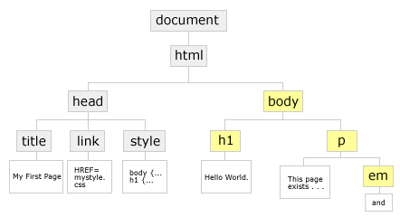
The box model describes H1 and P as adjacent boxes contained within BODY. The genealogical tree describes one element contained in another as a descendant of the first.
In our page, H1 and P are siblings. Both are children of BODY. EM is a child of P and a grandchild of BODY.
Because H1 and P exist side-by-side at the same level in the document tree they are called adjacent siblings. If a second paragraph were appended to our tree, it would be adjacent to the first paragraph, but not to H1.
When we select P in a style rule, we tacitly select all P elements in BODY. Another way to write the selector would be: "BODY P" . The space indicates P is a descendant of BODY. It could be a child, grandchild, or even further down the tree, but the selection would still apply.
It would be redundant to stick BODY in front of all selectors in a style sheet. However, this same notation can be applied to any other relations in the document.
Here are a handful of ways EM could be selected:
  em    (select all emphasized text)
  p em    (select emphasized text in paragraphs only)
  ul em    (select emphasized text in any unordered list)
  li p em    (select emphasized text only in paragraphs contained in list items)
The selectors above affect all EM elements descended from the elements listed before them, no matter if they're children or later descendants. But CSS can be more precise.
">" CHILD SELECTOR. The child selector limits selection to the direct child of an element. Let's say you have a definition list, and the definitions are annotated with paragraphs, blockquotes, other lists, etc.:
  dd > em   (select EM only in the definition proper,
                     not in ancillary quotes or paragraphs it might contain)
  dd > blockquote > em  (select EM only when it's a child of a blockquote
                     which is a child of a definition — EM must be a grandchild of DD)
" * " BEYOND CHILD SELECTION. This is the complement of the child selector. It selects all descendents except children. If you have deeply nested paragraphs in a set of DIV's, you could set all but the first-level children to gray with "div * p {color: gray;}". The universal selector " * " stands in for any of DIV's children, causing the selector to start with P's which are grandchildren or later.
- "+" — ADJACENT SIBLING SELECTOR
- h1 + p select P when it immediately follows H1
You can see how this would be useful to specially format only those paragraphs immediately following an H1 heading, opening up extra space, or specially treating their first lines.
Other useful forms include:
- h1 + * select H1's sibling, whatever it is
- h1 + p + * select H1's 2nd sibling when the 1st is P
- h1 + p select P when it immediately follows H1
- [att] — ATTRIBUTE SELECTOR
- a[href] select only those anchors with an "href" link
I use this selector to underline only those links that contain "href".
- a[href] select only those anchors with an "href" link
- [att="val"] — ATTRIBUTE SELECTOR BY VALUE
- a[href="mysite"] select A when HREF exactly equals "mysite".
Unfortunately, IE version 6 doesn't support other powerful selectors available in CSS version 2. IE v.7 and v.8 improve support for CSS2, but don't support any CSS3 selectors (except for substrings in attributes).
As you can see, CSS allows very focused selection. And, as always, specificity outweighs inheritance. The rule, "em {color: red;}", affects all emphasized text in BODY, but "p em {color: green;}", being more specific, replaces red with green for any emphasized text in paragraphs. When a rule doesn't act as you expect, and it's punctuated correctly, keep your document tree in mind and try being more specific. This can be especially helpful when using the next three selectors.
Beyond the Element
Besides allowing you to select elements more precisely, CSS extends selection beyond the elements HTML defines.
- :pseudo-elements
- .classes
- #ids
:PSEUDO-ELEMENTS. CSS distinguishes between "pseudo-elements" and "pseudo-classes." These are marked the same way in style rules, so for the purpose of sloppiness, I'm conflating them here. You can read more about them in section 5.10 Pseudo-elements and pseudo-classes of the CSS specification.
CSS defines a set of terms to select elements based upon user interaction. User's typically interact with anchor links. So, :LINK, :HOVER, :ACTIVE, and :VISITED are pseudo-elements which allow you to choose different colors, mouse pointers, or text-decoration for anchors. Here are 4 commonly-used rules to change the behavior of links:
Commonly-used cursors include:
- pointer — the little hand you're used to seeing over links
- auto — whatever the browser would normally display in this context
- default — the normal cursor, usually an arrow
You can read the CSS2 specifications for cursors within the general definition of the language.
/* turn off underline */
a:link {color: #089; text-decoration: none; }
a:visited {color: gray; }
a:hover {cursor: cross-hairs;
             background: yellow; text-decoration: underlined;}
a:active {color: red; }
CSS also defines :FIRST-LETTER, and :FIRST-LINE to mimic features commonly found in print media. CSS defines these as in-line elements, so they can't be used to change margins (you can't produce hanging indents with them, for instance), but you can change font, size, case, and color with them. For example, the next rule uses the "text-variant" property to change the first line to small caps:
":First-line" does all the work here. No change in the HTML markup is needed.
/* display first line of any paragraph in small caps */
p:first-line {text-variant: small-caps; }

<p>":First-line" does all the work here.
No change in the HTML markup is needed.</p>
As above, pseudo elements may be used in descendant selectors, too: "ul li:first-letter" or "blockquote p:first-letter".
IE6 does not support all CSS-2 selectors. It understands :FIRST-LINE, but not :FIRST-LETTER. And, it ignores the :FIRST-CHILD selector. You can see how this would streamline your markup. If, for instance, you marked major divisions in an essay with DIV. Then, "div p:first-child:first-line {text-variant: small-caps;}" would display as small caps the first line of any paragraph in a major division.
.CLASSES (Things are about to become interesting, or at least less boring.)
CSS allows you to invent classes of elements. The next style rule invents a class of paragraphs named "hilight" with light yellow backgrounds. (The period is all important):
p.hilight {background: #ffc; }
Apply this style to paragraphs in your HTML thusly: <p class="hilight">My highlighted paragraph.</p>) .
The rule can be rewritten to apply to any element as needed. Use CSS's universal selector ("*") rather than P. You may do this in 2 ways:
  *.hilight  select any element belonging to class "hilight"
                    (the next form is more common)
  .hilight    if no element is given, "*" is assumed
This form of the selector allows any block-level or in-line element to belong to the class "hilight":
A paragraph with a yellow background.
A word or two with a yellow background.
<p class="hilight">A paragraph with
    a <em>yellow</em> background.</p>

<p>A <span class="hilight">word or two</span>
    with a <em>yellow</em> background.</p>
Applying style through context is even more powerful. Classes can have descendants, too. You may want emphasized text in a high-lighted section to appear red. This rule does the trick:
.hilight em {color: red; } /* display EM text as red inside any element belonging to the ".hilight" class */
Note how the above rule renders EM differently here, although the markup doesn't change:
A paragraph with a yellow background.
A word or two with a yellow background.
<p class="hilight">A paragraph with
    a <em>yellow</em> background.</p>

<p>A <span class="hilight">word or two</span>
    with a <em>yellow</em> background.</p>
Combining the notion of ".class" and descendant selectors can save you loads of work. The DIV element proves invaluable in this situation. (It marks divisions within a document.)
You can see how much effort this saves when you consider these two forms of markup. Both create a class named "menu" which is used to style elements distinctly. The first version relies on selection by class exclusively.
/* CSS rules for elements belonging to the MENU class */
/* set the font for our menu */
p.menu {font: 10pt/14pt arial, helvetica, sans-serif; }
a.menu:link {color: red; } /* change links to red */
a.menu:hover {background: yellow; }
/* apply a yellow background when the mouse hovers over a link */

<!-- HTML markup using the MENU class -->
<p class="menu"><a class="menu" href="">apples</a></p>
<p class="menu"><a class="menu" href="">oranges</a></p>
<p class="menu"><a class="menu" href="">sardines</a></p>
The above works, but needlessly bulks up the page — class="menu" appears 6 times, twice for each link in our menu.
This next version combines class with descendant selectors to style the menu entries by context. Our rules now define how P and A should act when they're descendants of the MENU class. Then, in our HTML, we place our menu links inside a containing DIV, which is a member of the MENU class. Viola! Notice how much simpler the HTML markup is — class="menu" appears only once, no matter how many links we might create.
/* CSS rules for descendants of MENU*/
.menu p {font: 10pt/14pt arial, helvetica, sans-serif; }
.menu a:link {color: red; }
.menu a:hover {background: yellow; }

<!-- HTML markup using the MENU class -->
<div class="menu">
<p><a href="">apples</a></p>
<p><a href="">oranges</a></p>
<p><a href="">sardines</a></p>
</div>
Not only does this reduce "page-weight," it makes it much simpler to add items to your menu, or to move them back into other parts of your document. Because they are styled through context, simply dropping them into the correct container satisfies all their styling needs.
Using classes well deserves a long discussion. Too long for this document. So, here are some rules of thumb:
- Use classes sparingly.
Not all browsers support CSS. However, they all understand basic HTML. When possible, apply style rules to basic HTML elements, rather than define a class. If you do so, browsers blind to CSS will still display important structures distinctly, even if inelegantly.
- Name classes according to purpose, not value.
It may seem slick to define a "red" class (.red {color: red;}) so that your markup can be self-documenting. Unfortunately, it soon enough will be lying to you. As we've just seen, stylesheets can be replaced on the fly, and what makes sense as "red" for one style, may work better as "green" in another. "NB", "note", "caution", etc. make better names. This may alter your wording in the document itself. In my example above, "yellow," is not a good choice in this regard. A different style sheet may change "yellow" to "orange". Even the word, "highlighted" would make no sense for browsers which can't interpret the style rule to begin with.
- Style by context when possible.
Authors new to CSS often insert class statements redundantly. In brief, if you find yourself using the same class repeatedly in adjacent elements, you can probably create a box around them and apply the class to it instead.
#IDs
IDs look like classes, but serve an opposite purpose. Classes group together. IDs single out. On a given page, any ID should be used only once. Its job is to identify a unique element (a table of contents, say, versus other kinds of lists, or a footer, versus other kinds of paragraphs).
Other than that, you work with them similarly. As you refine a text, it's not unusual to discover that what you thought made a good ID makes a better CLASS, and vice versa. A style rule for an ID looks nearly identical to one for CLASS. :
#footer {color: gray; font-size: 10px; line-height: 13px; }
An ID is marked in your HTML similarly, too. Like "class" it is inserted in the opening tag of an element:
  <div id="footer">
      <p>Page created and maintained by Anonymous.</p>
      <p>Last updated January 1, 1970.</p>
  </div>
IE6 and earlier browsers don't distinguish IDs from NAMEs clearly enough.
A page that contained both of these tags
<div id="survey">
<form name="survey">
would not be treated similarly in all modern browsers. Some would ignore the distinction, causing code that should target the DIV to be applied to the FORM.
IDs are useful for formatting, visual effects, and script manipulation. In modern browsers, they can be targeted by HREF, just as NAME can be. (LOOK OUT!) They're commonly used to define columns or menus, or other unique regions in a document. I use them on this page to name the DIVs that mimic pop-up "windows" or in-line glossary entries. There are 25 or so scattered hither and yon, but because each has a unique ID, each can be selected separately.
Fortunately, IDs and CLASSES are not exclusive. A single element can be assigned both. You've noticed that the pop-up "windows" are formatted similarly, but each is called up individually. The following division of labor makes this possible:
/* In CSS: define a hidden class */
.hidden {visiblity: hidden;  etc.}

<-- In HTML: define a DIV with unique ID, and assign it to the hidden class -->
<div id="uniquename" class="hidden">
   <p>window contents here...</p>
</div>
This allows the style of all pop-up "windows" to be set by the "hidden" class. But each can be displayed or hidden individually based upon ID. (For a description of the javascript which makes this possible, see the link at the bottom of this document.)
IDs are given more weight than classes. In the case of conflicting styles, ID wins. If ".hidden" sets color to green, but "#uniquename" sets it to red, color will be red. In other words, you can set the general look of related elements with class, and tweak individual instances with ID.It should be abundantly clear by this point why opening and closing tags correctly matters. If the final "</div> were forgotten or deleted in the example above, any subsequent text would be hidden, too.
Skill in using CSS, comes with a little head scratching. But these few concepts — descendant selectors, pseudo-elements, classes, and IDs — should be enough to make more advanced layout techniques decipherable.
CSS & the Box Model — (Intermediate Layout)
In this section
- float
- relative position
- absolute position
- fixed position
- 3 column layout
- 3 examples
- debugging tips
Assume that through some misfortune, you've filled your mind with a 1/2 dozen HTML elements and have memorized the 4 CSS properties that redimension boxes. You're ready, now, to push the boxes around. First, however, you may want to take a break, stretch, get a cup or two of coffee, a good night's sleep.
When rendering a page, a browser lays out the entire document on a virtual canvas. The windowful you see at any given moment is the viewport. The browser positions box after box upon the canvas according to normal flow, the set of rules used to format regular elements.
Positional CSS arrived in version 2 of the language. It is now possible to yank portions of your document out of normal flow, and place them elsewhere via two properties: FLOAT and POSITION.
FLOAT, combined with WIDTH, allows a box to slide horizontally inside its containing element. FLOAT can be either "left" or "right." WIDTH can be a fixed measurement, such as "200px," a percentage, or any other legal unit of measure. Like this:
- float: left; — shift the box left and wrap subsequent text around it.
- width: 40%; — reduce the box's width to make room for regular text
Every browser has bugs and none fully supports the standards recommended by W3C. However, current versions of Mozilla, Firebird, Camino, Netscape, Opera, Konqueror, and Safari support CSS better than IE6.
The good news is that IE 7 will be released in 2005 or 2006. Likely it will have figured out containment by then, and will have added or improved support for :hover, fixed, PNG, adjacent selectors, etc. And you'll be allowed to purchase a whole new operating system (and maybe a new computer) to get these improvements.
The better news is that they're available now. For free. In products that run better and faster on Microsoft's own operating system than IE6 does.
The above 2 properties create the floated box below. (It is then prettied up with a little help from properties we've already seen: margins, padding, border, and background.) Notice how normal paragraphs wrap around the floated box.
Full support for positional CSS is still emerging. The useful value, "fixed" is not yet supported by IE6. And, IE6 often mangles widths measured by percentage when the box is in more complicated structures. Netscape 4, notorious for CSS bugs, can manage some positional schemes if length values are given in pixels rather than percentages.
Simple, no? Want to float it right? Click change float to switch between "float: left" and "float: right." (IE6 can't do this dynamically, but these browsers can.)
What about content that shouldn't flow around a float? CSS provides the clear property. It can be "none" (the default), "left", "right", or "both". The last 3 force a box beneath any previous box that was floated left, right, or either way.
This paragraph, for instance, has "clear: left" applied, so it will always appear beneath the box above when it is floated left, but will wrap around it when the box is floated right.
Before diving into floats, please see these other examples, guidelines, and tips.
POSITION takes 4 possible values:
- position: static — no special position instructions—every box is static by default, hereafter called "normal"
- position: relative — the box can be shifted from its normal position
- position: absolute — the box is placed over regular content & can be positioned precisely in the document
- position: fixed — the box is positioned within the viewport, without regard to any other elements
RELATIVE POSITION: left, top, right, bottom
A relative box is first positioned in normal flow. The browser makes space for it, just as it does for any normal box. However, it can then be shifted from that location with 4 offset properties: LEFT, TOP, RIGHT, and BOTTOM. (LEFT and RIGHT can take all units of measure. Not all browsers, however, support percentages for TOP and BOTTOM. Earlier CSS browsers, such as Netscape 4.x, support only TOP and LEFT. They ignore RIGHT or BOTTOM.)
These properties refer to the box's edges. "Top: 10px;" lowers the box 10 pixels below its normal location, whereas "bottom: 10px;" raises it. Because a relative box is offset from the space it would normally occupy, "bottom: 10px" is equivalent to "top: -10px". (These would not be equivalent for the absolute boxes, discussed next.)
Mainly this works as you'd expect. It's important to note, though, that the browser creates space for a relative box before applying any offset values. Their application does not resize that space.
The relative box to the left behaves normally until you shove it around. Then it overlays regular boxes in the vicinity. Try "top: -50px" or "left: 100px". Same for margins. Unlike floated boxes, margins shove a relative box over its neighbors. (You can send the box back home, if you like.)
ABSOLUTE POSITION: left, right, top, bottom, & containing blocks
Absolutely-positioned elements appear at the point the browser encounters them. However, they're taken out of normal flow, so no space is made for them among regular boxes. Instead, they're slapped on top of any regular content in their vicinity. If you specify offset values, the browser can position them more precisely. The question is, where is "left" or "bottom"? The answer depends upon the containing block.
Some boxes are more equal than others. BODY is the first containing block. It creates the boundaries for its children. Each normal box nested within BODY creates new boundaries for its children. So on and so forth.
A box pulled out of normal flow through "position: absolute" is different. By default, an absolute box will appear within the parent box, nestled against whatever padding it possesses. If, however, you specify any offset value, it won't be calculated against the parent box if the parent is normal. Instead, it will be measured according to the nearest "not-normal" ancestor (one which is not "static"). If none exists, that will be BODY itself.
It doesn't matter if an absolute box occurs at the very bottom of a long document nested deeply in a succession of normal boxes. So long as no other "absolute" or "relative" boxes exist among its ancestors, the declaration "top: 0px" will pop it to the very top of your page. Under these circumstances, "top: 0; left: 0;" or "bottom: 0; right: 0;" refer to the corners of the entire document. (You can review the standard here — see point #4.)
Check it out. CHILD DIV is an absolute box — the first child of a "normal" parent. It appears in the top/left corner of the parent on top of its siblings, the 2nd through 5th children. It starts just where the browser found it because no values have yet been set for left, right, top, or bottom.
position: absolute;
width: 30%;
This paragraph is a sibling of CHILD DIV but rendered in normal flow.
This paragraph is a sibling of CHILD DIV but rendered in normal flow.
This paragraph is a sibling of CHILD DIV but rendered in normal flow.
This paragraph is a sibling of CHILD DIV but rendered in normal flow.
Because the parent DIV is normal (or static), it does not establish a new containing block for CHILD DIV. Size or offset values applied to CHILD DIV should reference the nearest containing block. In this case, BODY.
Let's change its left margin from "auto" (the default) to 20 pixels. Click here for "left: 20px". See? This also explains why it is 30% the width of the screen, not of its parent. And why a centered CHILD DIV is centered on the screen, not within PARENT DIV. (Center would be calculated as (100% - CHILD_DIV_width ) / 2. Click here for "left: 35%".)
If you're using Opera or IE6, you'll notice that they calculate the width of CHILD DIV based on the normal parent, not the proper containing block. And, IE6 can't bring itself to place CHILD DIV at the true left edge of its parent where, by default, it belongs.
An absolute or relative box does establish a new containing block for its positioned descendents. Below is the same CHILD DIV, this time inside a relative PARENT DIV.
position: absolute;
width: 30%;
This paragraph is a sibling of CHILD DIV but rendered in normal flow.
This paragraph is a sibling of CHILD DIV but rendered in normal flow.
This paragraph is a sibling of CHILD DIV but rendered in normal flow.
This paragraph is a sibling of CHILD DIV but rendered in normal flow.
Now set the margin "left: 20px". Or center it with "left: 35%". Because the parent is relatively positioned, it provides the starting point for offset and width measurements here. (When more than one ancestor is relative or absolute, the nearest provides the containing block.)
So, offset values work differently for relative and absolute boxes. Because the containing block for an absolute box rarely matches its dimensions precisely, "bottom: 10px" and "top: -10px" are not equivalent, as they would be for a relative box.
That's about it for offsets, save this minor curiosity. When no offset value is given, an absolute box appears against the padded edge of its parent (normal or otherwise). But offset values are always calculated against the border. In other words, if an absolute or relative parent box has 30 pixel padding, and you want its absolute child to move 10 more to the right, specify "left: 40px". If you use "left: 10px" the child will jump 10 pixels to the right of the border, 20 pixels left of its default location.
Z-INDEX. As you see above, absolute boxes overlay their normal neighbors. And they can overlay each other with equal disregard. Below are 3, each with a differently-sized font rendered in successively darker colors.
You've seen this basic idea at work in another context already: the summary of common HTML elements. That list is held in an absolute box. When you roll the mouse over any individual element, a 2nd absolute box appears over the summary.
We've already seen how positioned boxes can be moved along an x-axis (left/right) and y-axis (top/bottom). They can also be controlled along the z-axis (background and foreground). To change the "stacking order" of your absolute boxes, use the Z-INDEX property. Normally, the earliest box encountered winds up on the bottom, the most recent on top. Z-INDEX allows you to set their order explicitly. The highest number will be on top. "Z-index: 3" appears above "z-index: 2" appears above "z-index: 1", etc. You can set an artifically high value, such as "z-index: 99", to insure a box will always be on top. And you can set negative values to insure the opposite, "z-index: -10". (Note: this may place the box behind a solid background and thus out of sight.)
FIXED POSITION: great potential, limited support
Currently, IE6 only honors FIXED for backgrounds. This is too bad. On long documents, a fixed menu would improve navigation. Here's how it works on more standards-compliant browsers, such as Mozilla or Camino. The viewport (the browser's window) provides the containing block for any fixed box. If I was clear enough in the previous section, that's about all you need to know.
In other words, position and size values refer to the edges of the browser window. "Top: 10px" would nail a fixed box 10 pixels below the top of the window, and there it would stay, regardless of movement through the regular document. This allows you to place a menu, say, or an announcement, map, reminder, or other useful information in a constant position while regular text scrolls past it. If you'd like to see how this should look, unhide the fixed box on this page. If you scroll the text, the box stays put. (Not in IE6, however. Because it can't handle fixed boxes, it places them messily amongst the regular boxes layed out in normal flow.)
You can also manipulate "opacity," making the box transparent, partially, or completely opaque — not unlike the cartoonist's sheets of acetate, onion-skin, and drawing paper. Click the  icon to check it out. In this demo, I've actually defined 2 boxes for the same location — one exists only to hold the background, whose opacity varies. This allows the text on top to remain darker and more legible. You should be able to change the opacity of any box, but not all browsers support this. IE v6 supports opacity only on absolute boxes. Opera v7.5 supports fixed boxes, but ignores opacity for them, too. It also has minor bugs with VISIBILITY. When a box is hidden, it sometimes leaves remnants until you scroll the text. Firefox, not to be left out, in certain cases mispositions by 1 vertical pixel regular text which scrolls over a hidden fixed box, making the text look italicized or misshapen. For this reason, I'm using "display: none" rather than "visibility: hidden" for this fixed box demo.
(These links jump to recent topics, without destroying this menu.)
This box made with:- position: fixed;
- width: 125px;
- top: 3%
- right: 3%
Again, this example is a gimick. Usually, such a menu would remain on screen within a margin reserved for it. Until Microsoft supports the fixed value more fully, pages will probably continue to rely on absolute and relative boxes for more complicated layout.
Before moving on, let's look briefly at a common page layout, comparing absolute and floated boxes to achieve similar results.
Absolutely-positioned DIVs underlie many layout schemes. Here, 2 boxes are placed in the empty spaces created by ample margins.
Left and right margins are set by percentage here, so things should stay balanced at various window sizes.
For this example, I've mimicked the following positional rules.
- body {margin: 30px 25%; }
- .Lbox, .Rbox
{position: absolute; width: 20%; top: 25px; } - .Lbox {left: 1%; }
- .Rbox {right: 1%; }
(NOTE: The CLASS selectors Lbox and Rbox can be grouped to receive the same POSITION and WIDTH. Then separated to receive distinct LEFT and RIGHT values.)
blue robot
glish
CSS Zen Garden
box lessons
This box made with:
- position: absolute;
- width: 20%;
- top: 25px
- left: 1%;
Each of these DIVs, for example, has a different background image. This window places it at bottom right with no repeat.
This box made with:
- position: absolute;
- width: 20%;
- top: 25px
- right: 1%;
For text-only or older browsers which do not understand CSS, absolute boxes offer this advantage. They can follow the main content in your HTML markup, relying on TOP to pop them into place. This way, a user of a non-CSS browser will encounter the main text before the menus.
If the two absolute boxes physically preceded the main content, then they'd line up beneath the masthead by default. In which case, you could dispense with the "top: 25px" declaration.
Several terrific sites illustrate layouts like this and others. I've listed only a few under Layout Resources above.
Floated DIVs can easily produce this same 3-part layout. And it is somewhat easier to preserve a minimum distance between the floated boxes. You can set a minimum width on the parent box (ex: "min-width: 300px"). Then, if the viewport becomes narrower, the parent box stops adjusting and the flanking boxes stop sliding towards each other. (This is also how it should work with absolute boxes, but IE6 continues to let them slide — almost as though they were relative to the viewport.)
The rules for floating the menus are equally simple:
blue robot
glish
CSS Zen Garden
box lessons
This box made with:
- float: left;
- width: 20%;
- margin-left: 1%;
This box made with:
- float: right;
- width: 20%;
- margin-right: 1%;
The absolute boxes above require wide margins. Without them, the boxes would cover part of your text.
By floating the boxes, you also have the option of abandoning 3 columns, and letting your main text wrap around one or both boxes.
This example mimicks these rules:
- body {margin: 30px 25%; }
- .Lbox, .Rbox {width: 20%; }
- .Lbox {float: left; margin-left: 1%; }
- .Rbox {float: right; margin-right: 1%; }
(A floated box can only be positioned through margins. However, a box can be both FLOATed and RELATIVE. In that case, you have the option of using left, right, top, and bottom, in addition to margin.)
Because FLOAT only affects horizontal placement, you can't rely on TOP or bottom to reposition a floated box, as you can with an ABSOLUTE element.
FLOAT can complicate alignment unexpectedly. The CSS standard applies CLEAR to ALL previously floated elements which are in the same "block-formatting context" — it doesn't matter if the float is inside a different column or not. See what happens in the middle column below if we float its CSS rules to the right, then apply "clear:both" to the following paragraph? A large gap appears above the cleared paragraph.
blue robot
glish
CSS Zen Garden
box lessons
This box made with:
- float: left;
- width: 20%;
- margin-left: 1%;
This box made with:
- float: right;
- width: 20%;
- margin-right: 1%;
- body {margin: 30px 25%; }
- .Lbox, .Rbox {width: 20%; }
- .Lbox {float: left; margin-left: 1%; }
- .Rbox {float: right; margin-right: 1%; }
This example mimicks these rules:
The gap above this paragraph exists because the browser has pushed it beneath all previously-floated boxes.
One solution is to remove "clear: both" from the paragraph above. Then place the initial floated list of rules and the 1st paragraph inside a new DIV which has "overflow" set to "auto".
Why this works: "overflow: auto" causes the browser to set the bottom edge of the new DIV to the length of its longest child, forcing the following paragraph beneath it. It never has a chance to flow, which "clear" is intended to prevent.
A simpler solution is to apply "overflow: auto" to the entire middle column. Check it out: overflow: auto versus overflow: visible ("visible" is overflow's default setting).
Why this works: "overflow: auto" creates a new block-formatting context for the middle section. Consequently, the 2nd paragraph clears only floated boxes inside that new context. It ignores the left-hand and right-hand boxes.
(These CSS properties establish block-formatting contexts: float, absolute position, inline-blocks, table cells, table captions, and overflow -- if "overflow" isn't "visible").
Is there a right choice? For CSS-capable browsers, probably not in this example, since we're providing space for the boxes through margins. The content of the boxes themselves would help you decide for non-CSS or alternative browsers.
In other situations, however, their different strengths are more apparent. If you want your regular text to flow around your box, use FLOAT, or both FLOAT and RELATIVE. If you want a box to appear without regard to regular elements, use an absolute box.
OK Time to revisit our basic.html page and apply some new rules. You'll notice our page now declares its DOCTYPE and character encoding — first discussed under "validation." (If you like, you can review the note here.)
The page sports a new menu and footer, created with 2 new DIV elements. The menu and footer DIVs simply create boxes to format and position their contents. More puzzling, perhaps, is the "bg" DIV. I'm using it to position a 2nd background image behind the main content. In the first style sheet, it's used to breakup the somewhat blocky layout, although purists might object. This is "non-semantic," and introduces a DIV used purely for "presentational" purposes. While it is purely a design tic, and not part of the document's structure, it doesn't seem a bad compromise to me. It introduces very little extra markup (a mere 22 bytes) and is easy for a browser to ignore. Furthermore, it doesn't nail the page to 1 design. As examples 2 and 3 illustrate, the same DIV can hold other graphics and be styled differently.
<!DOCTYPE html PUBLIC "-//W3C//DTD XHTML 1.0 Transitional//EN"
"http://www.w3.org/TR/xhtml1/DTD/xhtml1-transitional.dtd">
<html>
  <head>
    <meta http-equiv="Content-Type" content="text/html;charset=utf-8" />
    <title>My First Page</title>
    <link rel="stylesheet" type="text/css" href="mystyle.css" /><!-- stylesheet -->
  </head>
  <body>
    <div id="menu">
       <ul>
          <li><a href="">courses</a></li>
          <li><a href="">writing</a></li>
          <li><a href="">projects</a></li>
          <li><a href="">errata</a></li>
       <ul>
    </div> <!--end menu-->
    <div id="bg"> <!-- box for 2nd background -->
      <h1>
        Hello World.
      </h1>
      <p>
        This page exists purely to illustrate
        rudimentary HTML markup
        <em>and</em> CSS styles.
      </p>
      <div id="footer">
         <p>Maintained by <a href="mailto:me@myaddress">Me</a>.</p>
         <p>Last updated: 7/5/2004</p>
      </div> <!--end footer-->
    </div> <!--end bg-->
  </body>
</html>
You may wonder why I've placed the menu links in an unordered list, rather than in paragraphs. Lists are great for menus, because a style sheet can format them vertically ("display: block", which is the default) or horizontally ("display: inline", as shown in the 2nd example below).
Hello World.
This page exists purely to illustrate rudimentary HTML markup and CSS styles.
With these new structures in place, we can define style rules to format them. This version places the menu and footer in opposite corners of the page.
I'm after more fine-grained control, here, so the style sheet below is fairly explicit. At first glance, it may appear forbidding. Most of the bulk, however, is caused by explicit border, margin, and padding declarations. These are more numerous than you would generally need. By being specific here, though, I can maintain a little more uniformity across various browsers.
If you glance lightly over the more familiar properties, you'll see that I'm mainly positioning various boxes, as well as setting their fonts and colors.
/* MYSTYLE.CSS -- demo style sheet */
body {background: white url(cuphome.jpg) no-repeat bottom right; }
/* create large box to hold 2nd background image */
#bg {postion: absolute; top: 0px; left: 0px; width: 100%;
   background: url(../img/swoops.gif) no-repeat 50% 25px; }
h1 {color: #aaa; }     /* medium gray */
p {color: maroon; margin: 10px 30% 20px 10%; }
/* 30% right margin makes room for image and menu */

/* style the menu box */
#menu {position: absolute; width: 23%; right: 3%; top: 10px;
   padding: 1%;
   border: 1px solid #f8f8f8;
   border-color: #f8f8f8 #eee #eee #f8f8f8;
/* set font and list style for menu */
#menu ul {list-style: none; color: #8ac;
   margin: 0px; padding: 3px; }
   font: .8em/1.2em verdana, arial, geneva, helvetica, sans-serif;}
/* set the color for menu anchors */
#menu a { color: #479;  }
/* set their hover behavior */
#menu a:hover {color: #09d; background: #fff;
	border-right: 1px solid #ddd; border-bottom: 1px solid #ddd; }
/* footer style -- explicit margins/padding make browsers behave */
#footer {margin-top: 10px; margin-bottom: 35px; }
#footer p {color: #888; margin: 0px; padding: 0px;
	font: 9px tahoma, verdana, arial, geneva, helvetica, sans-serif; }
Below are two other presentations of the same markup. I don't list the complete style sheet for each, but the main differences can be seen by mousing over the links held in the "menu" DIV. Again, "menu" refers to the box holding the list of links. Even though the menu box has no borders applied in the next 2 samples, it serves the same function as in the first, allowing us to style the links by context and position them distinctly. The links themselves are list items held in an unordered list.
Hello World.
This page exists purely to illustrate rudimentary HTML markup and CSS styles.
- #menu ul {text-align: center; }
LI style inside MENU
- #menu li {display: inline;
- padding: 0 2px 2px;
- margin: 2px;
- border: 1px solid #fee4b4; }
ANCHOR style inside MENU
- #menu a {color: #b62; }
- #menu a:hover {color: orange; }
- body {background: url(paperyellow.gif); }
BG sets 2nd background
- #bg {background: url(happyface.gif) no-repeat left bottom; }
Float H1 and shade 2 edges
- #bg h1 {float: left;
- padding: 10px 5px;
- border-right: 1px solid #eda;
- border-bottom: 1px solid #eda;}
Besides tweaking color, font, and margins, this version depends on declarations such as "display: inline" and "text-align: right" to achieve its effects.
Hello World.
This page exists purely to illustrate rudimentary HTML markup and CSS styles.
- #menu ul {
- list-style: none; /* no bullets */
- font-size: .8em;
- margin: 0px;
- padding: 2px 5px; }
ANCHOR style inside MENU
- #menu li {text-align: right; }
- #menu a {color: #abc; }
- #menu a:hover {
- color: white;
- background: #cde; }
- body {
- background: white url(3birdbook.gif)
- no-repeat bottom; }
BG border-left divides MENU & text
- #bg {border-left: 1px solid #eee; }
Set color for H1 inside BG
- #bg h1 {color: #abc; }
This example is more of the same, but locates the menu with "left: 1%" and .bg receives a thin left border to set it off from the menu.
Not lost in the welter of details, I hope, is the main point: CSS gives you flexible, powerful presentation options, easy to implement and update. Most browsers in use today support the majority of the properties I've mentioned. For those which don't, here are a few general guidelines.
If possible, arrange your HTML so readers without CSS find your important content easily.
When images are adjacent, double check your ALT text to avoid unintended juxtapositions. Users can turn off image display, or they may be reading your site with LYNX. In either case, "[return][my face]" may not be your intended message.
Generic ALT text is often little better than none. [logo] could be more specific. You can always use LONGDESC to provide extra information.
If you have a hot design idea for a title or menu that really can only be rendered graphically, you can place your graphic as a background image, and mark the textual equivalent (needed by search engines and text-only browsers) as "display: none". Particularly with menus, a LONGDESC may not be adequate. This technique is widely used, but is not without controversy. For a counter argument regarding accessibility, see Facts and Opinion About Fahrner Image Replacement. For a reply, see In Defense of Fahrner Image Replacement.
And really, despite this document's length, the concepts it covers are relatively few. Most pages can be created with a dozen HTML elements and another 15 or so CSS properties. The box model and the document tree provide the metaphors necessary to mark a page's structure clearly and select portions of it effectively.
As you begin working with CSS, there will be times when the results of your rules surprise you. This short list of symptoms and causes may save you time down the road:
-
You've added a new rule and several things suddenly look strange.
A typo in the rule is often the culprit. For example, a missing semi-colon between 2 declarations will cause the browser to ignore both.
-
You add several rules, but only some of them work.
If this isn't due to a typo, then another rule has precedence. Rules for ID's outweigh those for classes. Rules for classes outweigh those for regular elements. Review the concept of the document tree and specificity, then try a more specific selector. (Or, possibly the order of your rules or style sheet links is an issue. Make sure the rules cascade from general to specific.)
-
Spacing is screwy.
Many factors influence the space a browser creates on a page. It isn't always clear whether the space comes from a parent's padding, a child's or sibling's padding or margins, or a child's or parent's offset values. You can discover this quickly, though, by temporarily placing different colored borders around the elements. For a general tip about spacing, see the discussion of floats. In general, apply margins and padding to a few larger structures, rather than to many smaller elements.
-
The layout is fine in Mozilla and Opera, but weird in IE6.
Browsers do not share the same assumptions about how to format elements. Setting explicit margins and padding on all the elements in question often helps. Or, you've stumbled against another IE6 bug or lack of compliance with web standards. No shortage there. Fortunately, the same design can be achieved in many ways. Try another approach and see if IE6 can manage to render it correctly. (I've needed to do this many times with this document.) Test your work in several browsers as you develop your style rules — I say with some hypocrisy. This document attempts to introduce general concepts to a few readers, not be accessible to a wide audience.
But what if you have created a masthead, menu, or footer which you'd like to reuse on all your pages, as conveniently as you can a style sheet? If your e-mail address changes or you add new links to your menu, must you edit every one of your documents to update your site?
Server-Side Includes — reusable content
In this section
- including files
- parsing html files
- 1 last example
When you markup a document, you create a set of instructions which a browser must ultimately puzzle out. A browser requests a page. The webserver, acting a bit like a reference librarian, locates the document and hands it over, all the while assuming it is complete.
Server-side includes expand the server's role in this exchange — it no longer assumes a document is complete. Instead, it scrutinizes your markup, looking for any directions it should follow in order to complete the instructions the browser needs. The browser receives the same document, but only after the server has scurried about collecting and combining its various pieces.
This may slow down your site a bit. But it can save you a great deal of time. Let's say you've developed a nice menu and you'd like every page on your site to use it. You could copy and paste it into every document on your site. But, later, if you change the links in your menu, you'd need to edit each page to keep your site up-to-date.
Instead, you can move your menu into a separate file named "menu.html" (or some other appropriate name). On every regular page, then, instead of your menu, you could enter this server-side include:
<!--#include file="menu.html" -->
HTML is flexible about spacing — SSIs are not. The spacing must be exactly as you see it here: no space after the first two dashes, 1 space prior to the last two.)
The INCLUDE statement is enclosed in HTML's standard comment tag. The statement tells the server you want "menu.html" inserted here. The server dutifully looks for it and, if found, pours its content into the instructions before they're sent off to the browser. This form of INCLUDE, causes the server to look for "menu.html" in the same folder as the pages which include it.
Your site may become more complex, with separate folders for, say, "courses," "projects," "poems," "photos," etc. You don't want to place copies of "menu.html" in each folder. Instead, you change the include statement slightly:
<!--#include virtual="/menu.html" -->
This statement causes the server to look for "menu.html" in the same site as the pages which include it. In other words, if the address for your page is "http://www.mysite.edu/testing/basic.html", VIRTUAL instructs the server to look on "http://www.mysite.edu" for "/menu.html". This means, no matter where your pages may be scattered in your folder structure, they can rely on one identical statement to find your menu.
I'm not sure why, but people are often bewildered by folders. So, just to reinforce the point. Let's say you've created several files to be included in all your pages. In addition to "menu.html" you also have "header.html", "footer.html", and "scripts.html". You've stored them all in one folder named "inc", which is just off the root of your site. (The "root" is the entry point, or first folder on your site — the one from which all files and folders diverge.) Then, you could include "menu.html" with this statement:
<!--#include virtual="/inc/menu.html" -->
This statement instructs the server to look in the root of your site for the "inc" folder, and inside that, for the "menu.html" file. (When "/" begins a reference to a file or folder it means "root". Otherwise, the same symbol is merely a separator with no special value.)
Includes can be nested, too. This allows you to create menus with some consistent entries and others that change based upon context. Say you have uploaded 4 pieces of your own work to a "writing" folder, and each of these pages contains, <!--#include file="menu.html" -->. The INCLUDE refers to a "menu.html" file inside the "writing" folder, and its contents might be:
 <!--#include virtual="/mainmenu.html" -->
 <ul>
    <li><a href="p1.html">Poem 1</a></li>
    <li><a href="p2.html">Poem 2</a></li>
    <li><a href="short.html">Short Story</a></li>
    <li><a href="essay.html">Essay</a></li>
 <ul>
In this way, you could let the server build a compound menu with general links to your site and specific links to each piece of writing.
SSIs can do several other things for your pages, such as displaying the age of a page:
<p>Last updated:
<!--#config timefmt="%x" -->
<!--#echo var="LAST_MODIFIED" --></p>
These lines first set the format for the date, then insert the timestamp of the file, producing:
Last updated: 05/21/10
If you're curious about formatting dates and times, HTML goodies provides a nice summary. The same site includes a good overview of SSIs generally. As do these sites: NetMechanic, WebRef, and Website Tips.
There's a tiny wrinkle in this arrangement. A typical "html" page is never scrutinized in the way I've just described. Instead, the special extension ".shtml" is reserved for files requiring server intervention. This allows a webserver to dish out typcial pages more rapidly. If only one or two pages on your site contain server-side includes, then it makes sense to name these specially.
However, you can instruct your webserver to examine all "*.html" files for server-side includes. And why not? if they all contain these instructions. UNIX mainframes generally run the Apache webserver. You can alter the behavior of your site through a special file named ".htaccess".
To set this up, simply create a file named ".htaccess" in the root of your site, and fill it with this line:
AddHandler server-parsed .html
Your webserver will now analyze (or, parse) every ".html" page for server-side includes. (Microsoft's IIS contains a similar provision, although it is enabled through the properties of the Default Website. The "Configuration" button under the "Home Directory" tab allows you to add .html as an extension to be parsed similarly to .shtml.)
The downside of depending upon SSI statements is two-fold. One, your site may run a little slower. However, you won't notice any appreciable lag, unless the server is already heavily burdened. Two, you can no longer preview your work as easily on your local computer. I noted above that the server cobbles your page together before the browser receives it. If you open such a page locally (by double clicking it on your hard drive), no webserver leaps into action. So your browser sees only the main content, but none of the included material.
This can be startling. Especially if your styles are part of an included file. As we've already seen, the look of a document can change radically due to styles. If they're absent, you'll see the browser's notions of how an unadorned page should look.
This slight inconvenience is easy enough to overcome. You can always upload your pages to a temporary folder to preview them. Or, you can develop new material in a "complete" page — one which contains all script, header, menu, or footer code. When ready, you can drop the new material into a regular page and upload that.
One last time, let's revisit our "basic.html" page — this time using INCLUDES. Below are 3 files needed to give any pages on your site consistent style, menus, and footers. Here, the server is instructed to find them in the root of the site:
<!DOCTYPE HTML PUBLIC "-//W3C//DTD HTML 4.01 Transitional//EN"
"http://www.w3.org/TR/xhtml1/DTD/xhtml1-transitional.dtd">
<html>
  <head>
    <meta http-equiv="Content-Type" content="text/html;charset=utf-8" />
    <title>My First Page</title>
    <link rel="stylesheet" type="text/css" href="/mystyle.css" />
  </head>
  <body>
    <!--#include virtual="/menu.html" -->
    <div class="bg"> <!-- box for 2nd background -->
     <h1>
        Hello World.
      </h1>
      <p>
        This page exists purely to illustrate
        rudimentary HTML markup
        <em>and</em> CSS styles.
      </p>
    <!--#include virtual="/footer.html" -->
    </div> <!-- end bg -->
  </body>
</html>
See how much less cluttered the markup has become, making it easier to concentrate on the main content of the page. The new lines above cause the server to insert the following files.
<!-- menu.html -->
<div class="menu">
 <ul>
    <li><a href="">courses</a></li>
    <li><a href="">writing</a></li>
    <li><a href="">projects</a></li>
    <li><a href="">errata</a></li>
 <ul>
</div>
The code in each file is exactly what it would have been if physically present in the "basic.html" file.
<!-- footer.html -->
<div class="footer">
   <p>Maintained by <a href="mailto:me@myaddress">Me</a></p>.
   <p>Last updated:
     <!--#config timefmt="%x" --><!--#echo var="LAST_MODIFIED" --></p>
</div>
If you prefer, you can distinguish the included files from regular HTML pages by giving them different extensions, such as "menu.inc". (However, if you decide to nest INCLUDEs in any of them, you'd need to use the HTML extension, or expand the server-parsed files in your ".htaccess" file.)
Nothing changes about the style sheet itself. Note, however, I added a forward-slash "/" to the LINK statement above. This assumes "mystyles.css" is stored in the root along with "menu.html" and "footer.html". It could be stored elsewhere, of course. It's common to store style sheets in a "styles" or "css" folder. In which case the LINK statement would contain: href="/styles/mystyle.css" (or) href="/css/mystyle.css".
You can see that INCLUDEs do for content what CSS does for style. Because the server patches your pages together at run time, any update to "menu.html" or "footer.html" is instantly inherited by all pages which include them.
Many of the strategies I use in this overview would not work well or at all on PDAs, cell phones, or WebTV. Alternate devices such as these may lack or partially implement CSS support. And, the interactive parts rely on javascript, which users may choose to disable on desktop computers.
That said, if you're curious how the popup windows are implemented, here's a brief description — just a few lines. (I lifted the general layout of the description from Zeldman's happycog.com site. The page width is fixed, but sits over a background which expands and contracts with the browser window.)
Rob Weller. Last updated: 05/21/10