Accessibility Logo
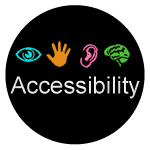
This Accessibility Logo was created by Christy Blew of The University of Illinois on behalf of the EDUCAUSE IT Accessibility Constituent Group. A goal of the Constituent Group is, in part, to raise awareness of accessibility among people who are involved in creating, purchasing, or deploying information technology on higher education campuses. The group formed officially in 2007, and in 2012 we felt our efforts could use some branding. The logo was specifically created with the intent of it showing up everywhere at the EDUCAUSE 2012 National Conference—on posters, flyers, stickers, PowerPoints, and more.
It was designed to be a generic logo, not branded for a particular organization or event, expecting that the branding effort could extend well beyond EDUCAUSE. It could show up on T-shirts, ball caps, coffee mugs, tattoos, and all sorts of other places. The more ubiquitous the logo is, the more likely people are to notice, and to ask questions, and to become aware, and to consider accessibility in times and places when it might never have crossed their minds before.
So, please use this logo widely! Encourage others to do the same. The logo appears below in various sizes, or you can download the high resolution version.


Description
The logo is a black circle with the word "Accessibility" appearing in bold white text. Four high contrast icons appear immediately above the text: a blue eye, a yellow hand, a red ear, and a green brain. These icons represent different modalities people use when interacting with technology—vision, touch, hearing, and cognition.
Logo Sightings
If you use the logo, or if you spot someone else using it, please share!
- On Flickr: flickr.com/photos/tags/a11ylogo
- On Twitter: #a11ylogo
License

This work is licensed under a Creative Commons Attribution-NonCommercial-ShareAlike 3.0 Unported License.