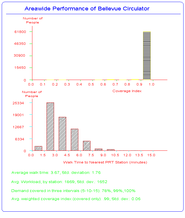
This display provides an overall assessment of the performance of a PRT network design. The top bar chart shows the number of potential patrons according to a coverage index. This index varies between 0 and 1, with higher values indicating a greater level of access to the system than lower values. The second bar chart shows the distribution of the walk times from all demand locations to the nearest PRT station. Here, lower values are better as walk times are shorter. The lower part of the display reports on some overall statistics about the performance of the design. First is the average value of the walk time distribution and its standard deviation about the mean. Lower values are preferred. Next is the average expected workload,by station, and the standard deviation of these values. The desired result is that no stations are "overloaded" and that all have a load above some minimum cutoff value. Lower values of the standard deviation are preferred as they indicate that most of the stations are working at loadings near the mean value.
The coverage statistics show the proportion of the total demand that can reach a PRT station in x-minutes. In this case the three class intervals are 0-5, 5-10 and 10-15 minutes. This result shows that 99% of the demand can walk to a PRT station in 10 minutes or less. These class intervals can be set to any travel time values that the planner wants to examine. The final statistic is the weighted coverage index. It varies between 0 and 1 and higher values are preferred as are lower values of the standard deviation. This result is very satisfactory and shows that this is a high performance design with little room for improvement, given the budgetary constraints provided for the exercise.
Return to the Bellevue PRT Study home page
Updated: April 15, 1996