Graphs to show trends in use of student UA services
The graphs below present system log data, graphed to try to demonstrate
usage trends. These may be helpful to measure progress as customers
migrate to other services. The usage levels may tell us if decommissioning
efforts are working and if additional measures are needed.
If you want a close-up - just the most recent 60 days,
see 60 day Usage stats UA student services
Graphs show daily counts of:
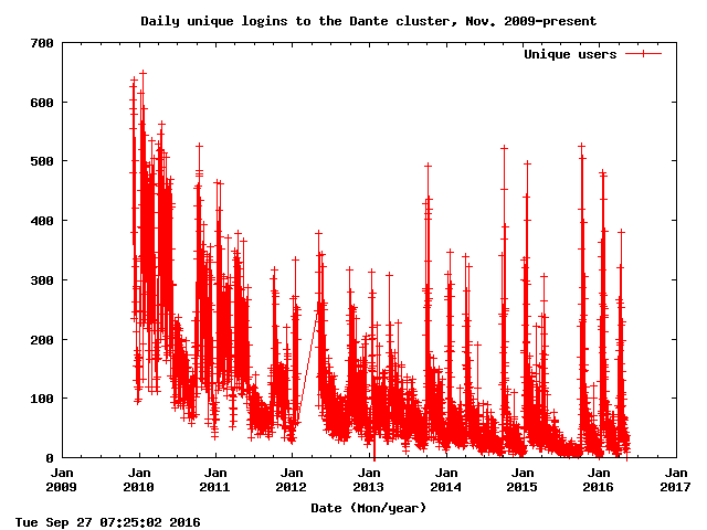
- Unique users logging in to Dante
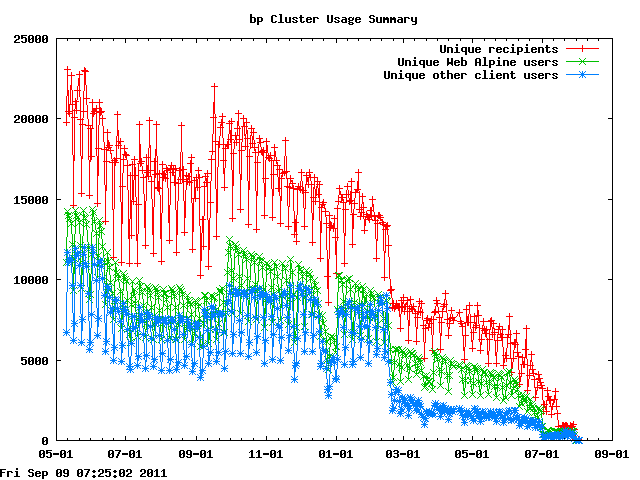
- Unique users to whom email is delivered on the bp cluster
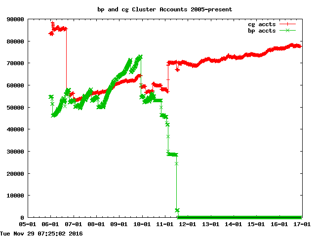
- Total accounts on the bp cluster (except expired or disusered)
- Unique users who use Web Alpine to read mail stored on the bp cluster
- Unique users who use non-Web Alpine clients to read mail stored on the bp cluster
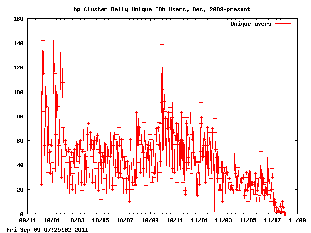
- Unique bp users who access the Email Delivery Manager (to see or adjust filters)
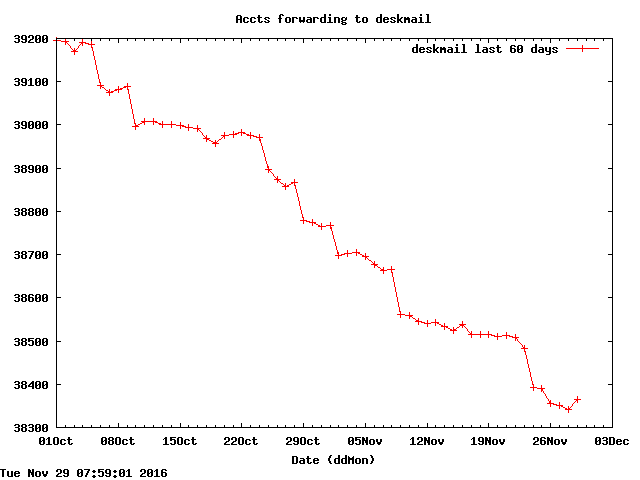
- Accounts (all, not just students) forwarding to deskmail (Last 60 days shown.)
Also see Student Email Forwarding Stats June - December 2010
Note that on Feb 15th migrations began to move 'staff' off the bp servers. For detail on that see Ken's note in the Work In Area archive
How many unique users log in to the Dante cluster each day?

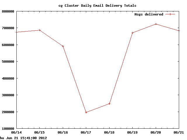
How many email messages get email delivered to bp each day?

How many total accounts are on the bp cluster?

- How many unique users get email delivered to bp each day?
- How many unique users read mail on bp via Web Alpine each day?
- How many unique users read email on bp via other email clients each day?

How many bp users access EDM each day?

How has the number of accounts forwarding to deskmail (bp and cg)
changed over the last 60 days?

![[University of Washington]](http://www.washington.edu/
home/graphics/uwid.gif) |
UW Information Technology
David Wall davidw@uw.edu
Modified: 14 May 2010
|
